Smart yet FUN Business Intelligence company seeks intriguing Web Design
Vous souhaitez remporter un projet comme celui-ci ?
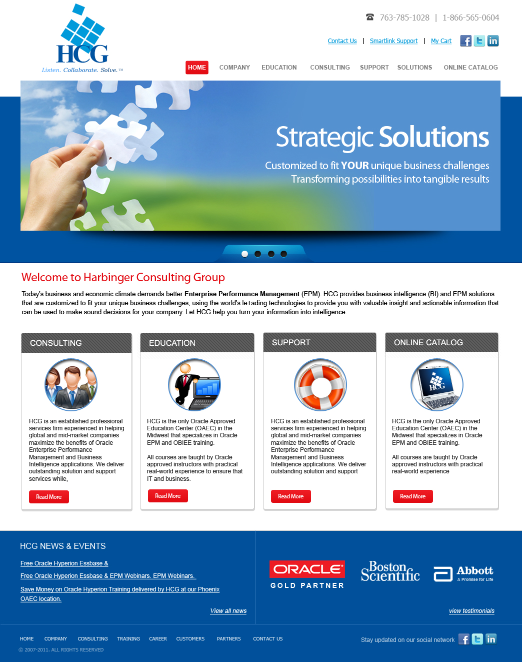
Ce client a reçu 31 web designs de la part de 7 designers. Il a choisi ce web design de OM comme design gagnant.
Inscrivez-vous Trouvez des Projets de Design- Garanti
-
 US$700
-
 31 designs
-
 7 designers
Brief de Web Design
We need a fresh new web redesign for a small business intelligence company. We provide education, consulting, and support services on Oracle Hyperion BI applications.
We need to find a small niche customer and get them intrigued about our Oracle services and keep them on our site to find out how we are different from our competitors. Our industry is about helping companies make sense of their finances, forecast their business, and plan for the future. We would like to see exciting imagery that sets us apart from our competitors yet is business professional. Our logo is comprised of a cube with dimensions as our tools use dimensional spreadsheets and reports to rework numbers. We would like to keep the logo and blue colors, but also add the signature Oracle red! We are looking to convey the idea of moving companies forward with intelligent ideas. Get people to enlist us as the driving force behind their decisions. Upward movement and Success utilizing our training, consulting and support services. HCG provides the roadmap to business futures! Our tagline is listen, collaborate, solve. Would like large dimension open feel, but background could be white or black or an image. Sky is the limit. Looking for creativity for a not so creative industry! Also looking at using Joomla or Drupal or Wordpress with some flash (java) in development. See .doc attachment for ideas, current site and competitors! Some image ideas are on an additional doc, but really would like to see new ideas or some cool renditions. Since our logo is a cube based on dimensions, adding "dimension" to our site would be clever! Our blue colors are PMS 293 and process blue, and adding Oracle red. It might be good to add some black contrast in the design. This project is for design, without code. thanks!
Mises à jour
thank you for all designs submitted, we are pleased to see some great ideas.
We are curious to see some additional ideas with the added contrast of black in the layout...one design used some black and looked good with the blues and red.
I did not include our blue colors from logo in original brief, but we use PMS process blue, and PMS 293, with the Oracle Red and open to other added color schemes with these blue/red and/or black.
thank you again.
Added Wednesday, October 05, 2011
Project Deadline Extended
Reason: We will be reviewing all submitted designs late next week with management, this gives a couple extra days for any new ideas.
thank you all
Added Thursday, October 06, 2011
Project Deadline Extended
Added Friday, October 14, 2011
Marché(s) Cible(s)
target market is financial analysts, CFO, finance industry, business intelligence companies from small to fortune 500 mainly North America and APAC
Secteur / Type d'entité
Small Business
Aspect
Chaque curseur illustre les caractéristiques de la marque client et le style que doit transmettre votre design de logo.
Élégant
Audacieux
Léger
Sérieux
Traditionnel
Moderne
Sympathique
Professionnelle
Féminin
Masculin
Coloré
Conservateur
Économique
Haut de gamme
Exigences
Doit avoir
- -We would like a home page, and two sub pages.
-Call outs for links to our catalog with images or fun graphics
-ability for rotating imagery on home page
-space to highlight news, & callouts to main pages for education, consulting, support
-company logo and oracle partner logo
-fun yet professional font styles for titles, etc.
-social media buttons for links
-live site will have drop down menus from tabs, breadcrumbs for direction
-main tabs for pages should be:
Company, Education, Consulting, Support, Solutions, Catalog
-would like section to highlight customers that links to testimonials. (maybe have customer logos linkable to testimonial page idea) customer logos would be for Boston Scientific, United Health Group, Abbott for a few.
Bien d'avoir
- -More of a dashboard or portal, direct users to the content they want
-Open it up, make it more inviting
-Directional text or icons or images
-customer log-in and search feature for site
Ne doit pas comporter
- -boring business people sitting at desks, pictures of excel spreadsheets.
-too much text, just brief text with link to more info.