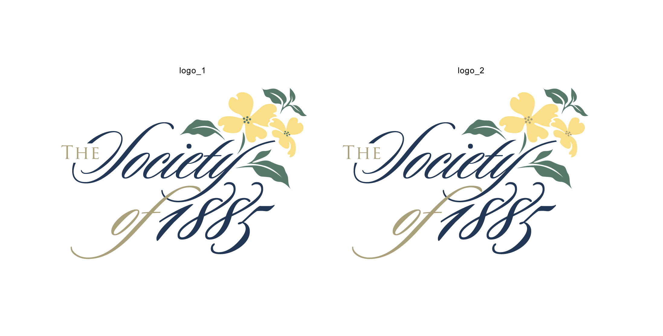
Logo design for a prestigious histroical society
Vous souhaitez remporter un projet comme celui-ci ?
Ce client a reçu 49 designs de logo de la part de 18 designers. Il a choisi ce design de logo de designguru comme design gagnant.
Inscrivez-vous Trouvez des Projets de Design- Garanti
-
 US$160
-
 49 designs
-
 18 designers
Brief de Design de Logo
Background:
The society of 1885 is a giving club for a Foundation. Donors support healthcare in this region by joining the club for a sum of money. The logo needs to feel steeped in history, tradition and exclusivity. It is named celebrate the group of founders who 130 years ago started the first “hospital” in a house. This has now become a massive health system of 5 hospitals serving a million people.
Logo Elements:
Logo Name: The Society of 1885
There are two key elements of the logo, the typeface that needs to be script, preferably with a “Jefferson” script type feel. The current font Kunstler Script. Happy to continue to use this font or something you suggest that has the handwritten Jefferson type feel. It needs to feel prestigious.
The second element is the symbol of a dogwood flower or flowers. The parent organization of this Society has a dogwood flower as its emblem. There are various ways to show this - a flat one dimensional shape or hand drawn, or flower with leaves, or just the flower or photograph of the flower creatively treated to make it work with the logo. So far we have favored the illustrated flower (see attached logo) which we like if we can get it to tie in better. See link here to dogwood flowers for your reference https://www.google.com/search?q=dogwood&espv=2&biw=1080&bih=622&tbm=isch&tbo=u&source=univ&sa=X&ved=0ahUKEwiq_cvn7u7KAhWCJCYKHUIPCwIQsAQILg
What we need:
The logo is not working well at the moment, it looks like type with a bunch of flower on top of it. The “Society of 1885” needs to be more prominent than the word “The”. We need the elements work together as one logo with all elements fitting well together. Here are a few suggestions but need to say, these are just suggestions we are open to your ideas:
One thing we do need is for “Society of 1885” to have more prominence than the word “The”. You can move the type
We need to have the dogwood fit into the design better. It needs to feel like part of the design. It may be extending the stem into the lower type, possibly making it one of the letters. It may be trimming the visual to just one flower and a few leaves, it may be that we need to add some design element of an emblem/shield around the dogwood to make it more formal. It may be that the entire logo needs a “border”. We are not crazy about wrapping the entire emblem into a oval or other shape border as we don’t want it to become a “seal”. It loses the freedom currently in the logo, but we are open to that option as well. At the moment it does not feel like the flowers integrated into the design in such a way that you know it belongs there. They are just floating and need to be incorporated in some way into the logo.
Color:
Color wise we are looking at soft colors, more like a water color. The flower has cream petals, green leaves and a yellow center. Typeface color needs to be regal – probably a navy blue, but again open to your ideas. Our corporate color palette is attached, feel free to use that.
Two options for design:
Please look at either improving the attached logo as per directions above or feel free to look at something totally different that uses the same elements of script typeface and dogwood flower to create something new. You can also provide both options if you wish to provide more than one design.
Marché(s) Cible(s)
Donors with high income. They belong to country clubs and like belonging to organizations. Both men and women, usually join as a couple. Age: 40 to 65+ Established in careers and usually have family or grandchildren
Secteur / Type d'entité
Club
Texte du logo
The Society of 1885
Aspect
Chaque curseur illustre les caractéristiques de la marque client et le style que doit transmettre votre design de logo.
Élégant
Audacieux
Léger
Sérieux
Traditionnel
Moderne
Sympathique
Professionnelle
Féminin
Masculin
Coloré
Conservateur
Économique
Haut de gamme
Exigences
Doit avoir
- See brief above for elements that make up the logo.
Bien d'avoir
- As per brief above either improve the attached logo or feel free to look at something totally different that uses the same elements of script typeface and dogwood flower to create something new.
Ne doit pas comporter
- As long as the elements of the logo in the brief are met the rest is open. Color palate attached is optional and just a guide you an use something similar or different.
- Color palate attached is optional you can substitute with something different.