International Supplement Company Requires Re-design of Product Label
Vous souhaitez remporter un projet comme celui-ci ?
Ce client a reçu 9 designs emballage de la part de 3 designers. Il a choisi ce design emballage de Priyo Subarkah comme design gagnant.
Inscrivez-vous Trouvez des Projets de Design-
 £110
£110
-
 9 designs
-
 3 designers
Brief de Design Emballage
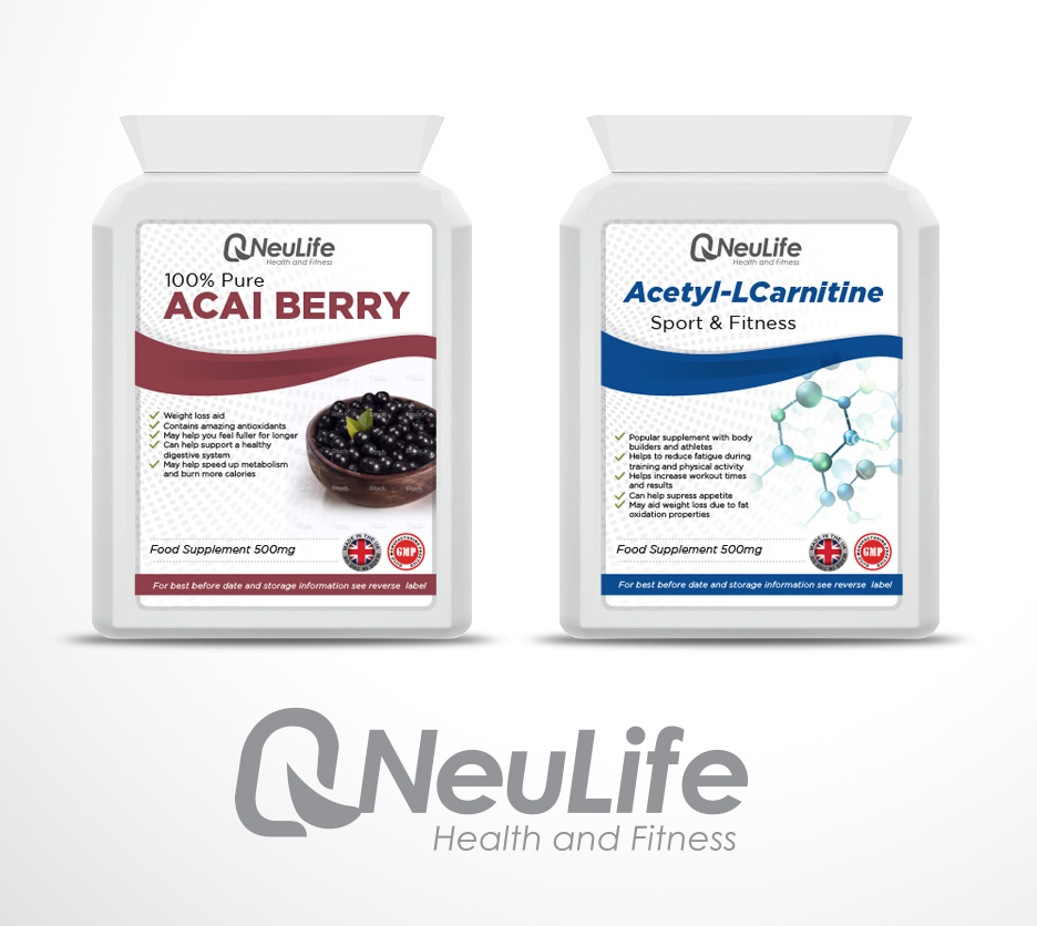
We are a company that manufactures and sells Nutritional Supplements. We have a wide range of products suitable for all different health needs; sports, wellbeing, weight-loss, ailments. The label needs to be suitable for all varieties of product.
We are looking to update our current supplement bottle labels to make our products appear more attractive and eye catching. We find our current label boring and it doesn’t stand out well when mixed with other competitor products on sites such as Amazon and Ebay.
We use flat postal pack bottles which are postal friendly and fit through a letterbox. Our product bottles contain a front and a back label. The bottles can be seen on our website – www.neulife.co.uk. It is the label on the front of our bottle which we require re-designing. The back contains all of the ingredients, directions, expiry, company info etc and is therefore font only and can be easily designed and laid out by us.
We have two sizes of labels – the first is 66mm by 86mm in size and the second is 86mm by 150mm. The design has to be transferrable from one size to the other.
We are looking for a design that is eye catching, memorable and which reflects quality and trust. We would like a clean, straight look with good strong colours. Our products are sold in shops and over the internet. The label design therefore needs to make our product stand out whether on a shop shelf, on a website or on a flyer.
Most of our products are unisex and not therefore targeted at any particular gender. We do however find that our range of sports supplements is purchased more predominantly by males and could therefore stand a slight variation in colour perhaps to make it a little more masculine.
We would like the range of sports supplements to stand out from the other products and would therefore ask that a slight variation be considered for this. We have considered using a darker colours and/or background on the sports range.
The product titles can vary immensely and have a different amount of characters and numbers in each. Some have very short titles (such as ‘Zinc’) whilst others have longer titles (such as ‘Glucosamine 500mg, Chondroitin 100mg & MSM 100mg’). This is something that needs to be considered when designing the area for the title.
The label needs to contain the following information: Product Title; Product Strength (ie mg); GMP logo; Company Logo; Quantity. Please note that some products, when containing more than one ingredient, have the strength written in their title and not listed separately. Please have a look at the different listings on our website to obtain an understanding of this – www.neulife.co.uk.
We have also considered the use of an image on some of our bottle labels, to depict the main ingredient contained within the product. Not all of the products lend themselves to using an image but some do. Please have a look at some of our competitor labels and see how they use images within their design – www.healthspark.co.uk www.healthspan.co.uk . Products such as Vitamin B Complex and Glucosamine would not lend themselves to having an image but products such as African Mango and Garlic would. We would be happy to source and apply our own images if you choose to produce a design which leaves a space for the image. We believe that the use of an image can sometimes help the product stand out from competitors and can make it more easily identifiable to some customers.
We require the logo to be produced and provided to us in a High Resolution PSD file with editable Layers
Secteur / Type d'entité
It Company
Texte du logo
Neulife Health & Fitness
Aspect
Chaque curseur illustre les caractéristiques de la marque client et le style que doit transmettre votre design de logo.