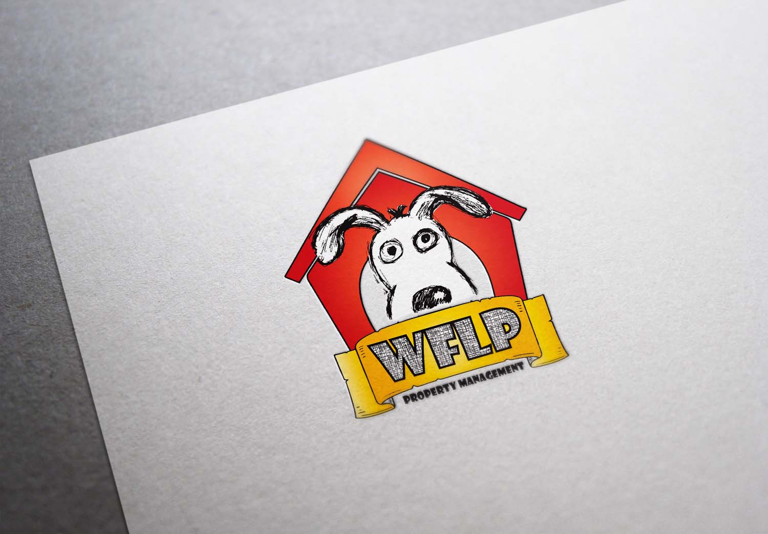
WFLP Property Management needs a logo design

Vous souhaitez remporter un projet comme celui-ci ?
Ce client a reçu 32 designs de logo de la part de 11 designers. Il a choisi ce design de logo de wearecreative4you comme design gagnant.
Inscrivez-vous Trouvez des Projets de DesignBrief de Design de Logo
I have a, rough, drawing that everyone (other than me) wants to see as our logo. If used, it needs to be combined with a "typeset" and cleaned up a bit. The "roughness" in this "art" seems to be part of the attraction and it needs to be kept as close to it's original form as possible. Transfer quality is an issue but it is apparently possible (see https://www.facebook.com/photo.php?fbid=1027468491983&set=a.1380705082677.2050309.1383423330&type=3&theater). I, personally want something that jumps off of our signs (2'x3' +-) and sets us apart from the sea of other signs along the road. I think the, maybe self perceived, necessity to keep the "dog" in Black and White format has soured me on this logo idea and I am open to suggestions. We have a website in it's final stages of development @ http://www.wflpmanagement.com/. It may give you an idea about our company...if that helps...Please call me at (434) 660-3423 with suggestions, prices etc...Thanks!
Marché(s) Cible(s)
Apartment and Home seekers via typical Real Estate sign (2'x3' +-) that also will have to include contact info and purpose (For Rent, Sale...) IE - The logo needs to be big enough to attract the eye. It has to be eye catching because it will be repetitively used not only on signs but also our website, print media, polo shirts, billboards etc...We would like this logo to be recognized in our market before they see our name.
Secteur / Type d'entité
Property Management
Texte du logo
WFLP
Styles de logo qui vous intéressent
Logo pictural
Un objet réel (texte facultatif)
Logo de figurine
Logo avec illustration ou personnage
Styles de police à utiliser
Autres polices appréciées:
- No specific font but we only have 4 letters. Bold, thick letters (like College Varsity letters) seem appropriate but I am looking for new ideas, not my own taste.
Aspect
Chaque curseur illustre les caractéristiques de la marque client et le style que doit transmettre votre design de logo.
Élégant
Audacieux
Léger
Sérieux
Traditionnel
Moderne
Sympathique
Professionnelle
Féminin
Masculin
Coloré
Conservateur
Économique
Haut de gamme
Exigences
Doit avoir
- Character, Imagination and Personality. It should be positive and not appear to be selected from an inventory of pre-drawn, ready made logos. We want different even to the extreme of unusual. The most important criteria is that this logo stands apart from all others that surround it. You may have to consider proper background color , though it would be best if the logo was universally adaptable. I personally believe that color is one of the best devices for attracting the eye but that is obviously an issue with the "art" that we have included.
Bien d'avoir
- Color, excitement...without losing professional dignity. Adaptability to many formats and uses (and sizes). Our company "colors" today are Kelly green and white but that is not something that can not be changed. The KFC Logo and WWF Logos (on the selection page) appeal to me as examples of what I envision but...I love original thinkers!
Ne doit pas comporter
- Please avoid anything that may possibly be construed as political, religious, race related etc...