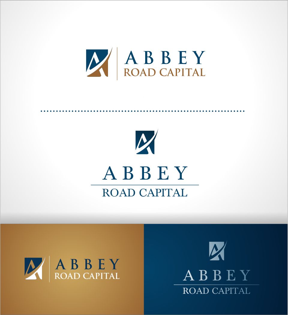
Logo design for Abbey Road Capital, a financial services company

Vous souhaitez remporter un projet comme celui-ci ?
Ce client a reçu 64 designs de logo de la part de 25 designers. Il a choisi ce design de logo de *mary comme design gagnant.
Inscrivez-vous Trouvez des Projets de DesignBrief de Design de Logo
I need a logo designed for a company that buys and helps homeowners refinance underwater mortgages in a way that creates equity for them. An underwater mortgage is one where the mortgage balance significantly exceeds the value of the home. We buy the mortgages from hedge funds at a big discount to the home's current market value. This is also a big discount to the mortgage's unpaid balance, so we can write off enough of the unpaid balance to help the homeowner refinance with a third party while still making a profit from the refinancing, which is more than we bought the mortgage for.
Marché(s) Cible(s)
Investors
Secteur / Type d'entité
Financial Service
Texte du logo
Abbey Road Capital
Styles de logo qui vous intéressent
Logo d'Enseigne
Logo contenu dans une forme
Logo pictural
Un objet réel (texte facultatif)
Logo abstrait
Conceptuel / symbolique (texte facultatif)
Logo mot symbole
Logo (texte seulement)
Logo de Lettermark
Acronyme ou logo texte (texte seulement)
Styles de police à utiliser
Aspect
Chaque curseur illustre les caractéristiques de la marque client et le style que doit transmettre votre design de logo.
Élégant
Audacieux
Léger
Sérieux
Traditionnel
Moderne
Sympathique
Professionnelle
Féminin
Masculin
Coloré
Conservateur
Économique
Haut de gamme
Exigences
Doit avoir
- The logo must show the consumer-friendly side of the business while signaling to investors that the company is a conservative, serious - even old line - financial company. So any graphics need to be conservative and in a the minimum number of quiet colors. I attach a jpeg that gets the idea across but with is too colorful and not abstract enough. Also, it does not show that we are helping, which needs t be part of the message. Likewise fonts, spacing, etc. need to be conservative. I favor a navy blue for fonts.
Bien d'avoir
- It ideally says what the company is while looking like a card that a Goldman Sachs or a UBS investment banker would have...even if that means making the graphics relatively abstract
Ne doit pas comporter
- bright colors, anything showy or cartoonish.