

 Rafraîchir
Residential | Commercial | Industrial Construction Company Seeks Amazing Logo
Vous souhaitez remporter un projet comme celui-ci ?
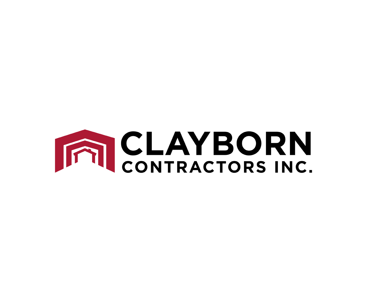
Ce client a reçu 108 designs de logo de la part de 22 designers. Il a choisi ce design de logo de Paul Anthony comme design gagnant.
Inscrivez-vous Trouvez des Projets de Design
-
 US$160
-
 108 designs
-
 22 designers
Brief de Design de Logo
Clayborn Contractors Inc was established in 1951. our website is http://www.ClaybornGroup.com/ClaybornContractors and is being updated for this complete identity overhaul.
I have lost the files but we traditionally used a steel frame and before that a home and a hand above as in attached file, be we need to go different direction. I like the more bold designs.
Maybe the word contractors can be made a lot smaller on the new logo to focus on Clayborn and the graphic, but I don't want to spoil something creative by you.
The Words Clayborn Contractors Inc were in Clarendon Condensed with Clayborn in a font about 2x's bigger than Contractors Inc. so it matched the width when placed above Contractors Inc.but it is a tired font from the 80's and I am looking for new ideas.
_____
/ / Clayborn
/ / Contractors Inc.
That kind of a thing with the graphic to the left i simulated with slants. But again we want a new take on it. The frame was in Red and the text black but again is there any new take on this you can provide?
It should state/say/show
Clayborn Contractors
and include an image. It could or could not state since 1951. It could add "Inc." It could possibly use initials and have the words to side and different size smaller for contractors.
But if a home, commercial business, or warehouse or other icon or combination can be placed to make our services make sense it would be great. I like logos that can then be placed on their own to brand our products in cases where the name won't fit. But I am anxious to see what you can do.

Mises à jour
Project Deadline Extended
Reason: Working through design revisions as posted to my existing designers means more time needed for all. The designers I have given feedback to already know what I am seeking and should have direction.
I want a modified more simplistic steel frame as the logo. Kind of like an upside U. In fact 2 or 3 of these red frames to the left of the company name nested inside of each other similar to how the frame is now. But without the clutter of the purlins and girts that secure wall sheets and roof sheets in the real world. Basically like the St Louis arch but having 2 sections for flat roofs, colored, and I am thinking texted unless someone has a better design without nesting. Frame in red. Name in black looks best so far. Optional "Since 1951" and a line below the name with the Since 1951 right justified.
I like seeing the logo in addition to the regular screen shot, on different backgrounds and textures and background colors. Please submit these different views on one submittal instead of individually.
These proposed changes would be more easily cut out of vinyl, better to embroid, have as a web browser favicon, etc.
I would like to thank each designer for their efforts thus far. It is truly appreciated. I am sorry that I only get to pick one and I know it will be tough.
Thank you!
Added Wednesday, January 13, 2016
Marché(s) Cible(s)
Midwest Indiana and Kentucky Homeowners, Business owners and large corporate clients with average projects ranging from $5,000 to $1M per project
Secteur / Type d'entité
Contractor
Texte du logo
Clayborn Contractors
Styles de logo qui vous intéressent
Logo d'Enseigne
Logo contenu dans une forme



Logo pictural
Un objet réel (texte facultatif)



Logo abstrait
Conceptuel / symbolique (texte facultatif)



Logo de figurine
Logo avec illustration ou personnage
Logo mot symbole
Logo (texte seulement)


Logo de Lettermark
Acronyme ou logo texte (texte seulement)



Styles de police à utiliser

Aspect
Chaque curseur illustre les caractéristiques de la marque client et le style que doit transmettre votre design de logo.
Élégant
Audacieux
Léger
Sérieux
Traditionnel
Moderne
Sympathique
Professionnelle
Féminin
Masculin
Coloré
Conservateur
Économique
Haut de gamme
Exigences
Doit avoir
- Must have an Amazing design. Must have nothing lukewarm or that looks like everyone else or that looks identically to what we have had. Kind of strong and bold and chiseled tough.
Bien d'avoir
- A modern take on the steel frame but this kind of doesn't resonate with the residential clients so I am not sure what we need. It would be cool if colors and style would convert well to badges and other conversions for different logos on products.
Ne doit pas comporter
- Boring design.

