True Blue Workwear Web Design Project
Vous souhaitez remporter un projet comme celui-ci ?
Ce client a reçu 22 web designs de la part de 6 designers. Il a choisi ce web design de ctbors comme design gagnant.
Inscrivez-vous Trouvez des Projets de Design- Garanti
-
 A$300
A$300
-
 22 designs
-
 6 designers
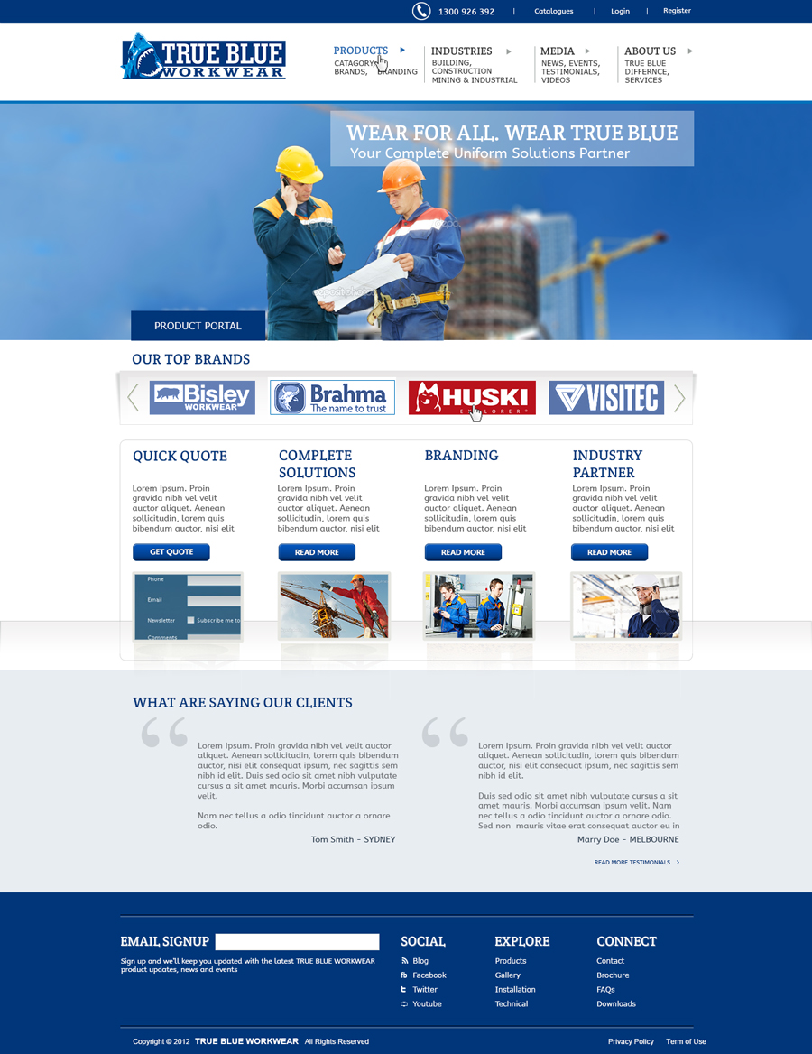
Brief de Web Design
New uploiad DESIGN 2 and DESIGN 3. These are examples of how we want to setup up our secondary pages. Only for layout purposes though. There design is a little to grey for us.
Limit blue colours to three (as per our logo). Other than blue, white should be used. We like to stay away from other colours, especially grey.
Based on the initial concent of our web site, I only like a few elements. These are:
- Header
- Mono coloured logos for brands, which then come to full colour when scrolled across The main brands we want used as examples are BISLEY / BRAHMA / VISITEC / HUSKI / VAN HEUSEN / BRACKS / PROCHOICE / WSP (Workforce Safety Products) / Biz Collection / Feel free not to use all, depending on how much room you have to work with. Can have a slide with arrow as to see more.
Layout needs to be clean, simple and not confusing. It needs to be of corporate style, since we are a business to business company and not a consumer one. Our brand is an Australian icon and this web site design needs to reflect this. Our main clientelle is Mining, Construction, Transport, Oil & Gas, although our motto is Wear for all, Wear True Blue which is to give the impression that we deal with all and everyone. We can cater to the needs of any business.
Attached is our site map / menu structure. The main titles will go across ways underneath the main header. Then a drop down menu of sorts will show the other titles one down. Any third level menus are only to be links in the pages of second level. We have highlighted featured menu subjects that we think could do with another link on the homepage also to highlight subject. Arrows down on the top level menu is to indicate then menu drops down. I do like this - open to suggestions.
Quick Quote and Industry Partner should be featured links in the main page, without being in the header menu.
Industry partner section would then relate back to the Industry Links - almost being like a header page for the rest of the Industries mentioned under the header bar.
BRANDS would have all the images of Brand under, with a possible small blurb about each one. There would be a left hand column with a menu of sorts
Industry would be set out similar with the left hand column menu, would have a few paragraphs about the industry and how we represent them through workwear, then with three rows across and three to four rows down of images which would be a small showing of what type of uniforms are on offer. No text is needed. Just want them to look clean.
Possible stamp like image - saying: THE TRUE BLUE DIFFERENCE on the main page.
Socia Media links. Being a business to business company, LinkedIN is an important social media link to have. Not so important, but still necessary is Facebook and Twitter. YOUTUBE.
Please keep in mind this site is to be an information site only. It's not an ecommerce site, so the web site will show a few images as examples, but nothing too specific about each garment, just an overview as such. There will be a seperate web site setup for a client portal for e-commerce side of things. A Login link and Register link on the main page are required for this. Also a VISIT THE TRUE BLUE STORE link.
Marché(s) Cible(s)
Business to Business - not consumer
Secteur / Type d'entité
E-Commerce
Aspect
Chaque curseur illustre les caractéristiques de la marque client et le style que doit transmettre votre design de logo.