Point of purchase Homepage redesign
Vous souhaitez remporter un projet comme celui-ci ?
Ce client a reçu 10 web designs de la part de 3 designers. Il a choisi ce web design de uk comme design gagnant.
Inscrivez-vous Trouvez des Projets de Design-
 US$250
-
 10 designs
-
 3 designers
Brief de Web Design
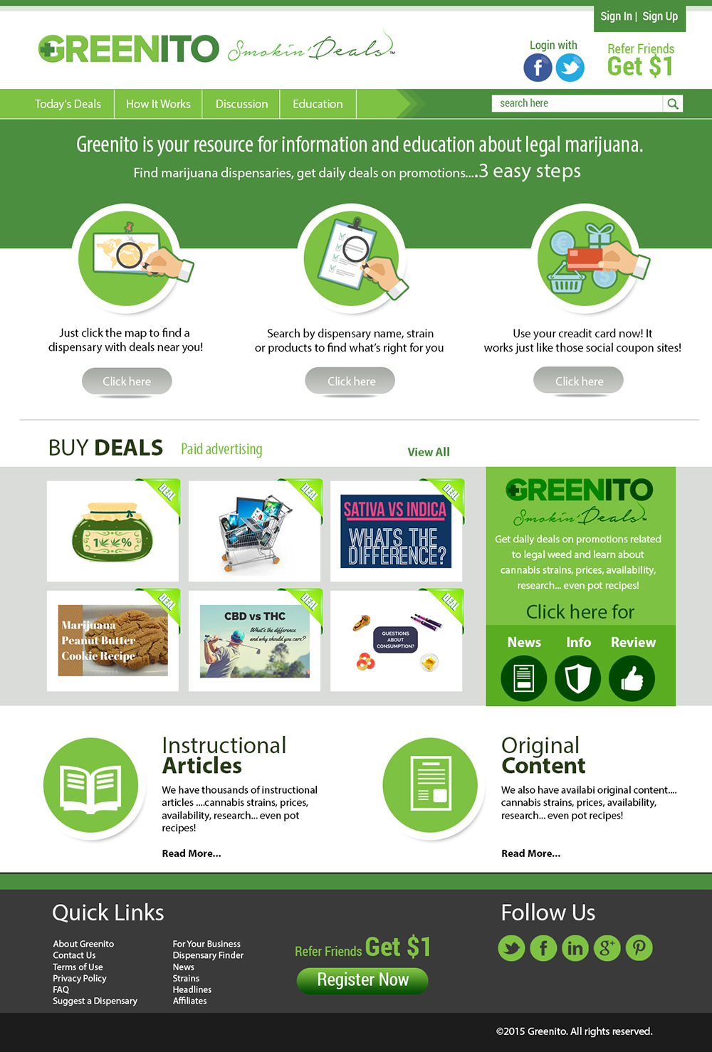
Our current homepage at www.greenito.com tries to accomplish 10 things. Which is about 5 too many. What if we condensed it to 3 easy steps plus a call to action about the award winning articles and the discussions? And showed the closest deals to them right on the home page?
Current structure is at www.greenito.com - this is what it was supposed to do
1) top left - tell people where there are dispensaries and where there are dispensaries with Greenito deals.
2) top right - slider showing interesting content in primary areas
MIDDLE FIELDS
3) Learn - sends people to News which is OUR PRIMARY CONTENT AREA AND DRAW
4) Products/Strains - educate people on what’s in the market. This is not a primary area because right now it’s not very interesting
5) BUY DEALS - this is how we make money
THEN BELOW THAT
6) News - this is an autofeed of headlines
7) FAQ - goes to Discussions. But it says it’s QA. We use a QA service but it’s currently off.
8) Forum - discussions. It’s buried so it doesn’t get any play.
8) Paid advertising
9/10) demonstrate social presence with Twitter/FB
This is obviously too much. And isn’t working well enough.
Attached is a photoshop with basically blanks but this here was my doodle - it’s more consistent with the structure of our mobile site.
Attached is Photoshop idea structure. I'm open to more ideas.
Mises à jour
Project Deadline Extended
Reason: I think we are on track to see one of these designs as the winner but I'd like to keep it open so that we can see new versions. Thank you.
Added Thursday, December 3, 2015
Marché(s) Cible(s)
Affluent people interested in finding information about marijuana - medical use, purchasing, positive lifestyle.
Secteur / Type d'entité
Software
Nombre de Pages Demandé
1 page
Styles de police à utiliser
Aspect
Chaque curseur illustre les caractéristiques de la marque client et le style que doit transmettre votre design de logo.
Élégant
Audacieux
Léger
Sérieux
Traditionnel
Moderne
Sympathique
Professionnelle
Féminin
Masculin
Coloré
Conservateur
Économique
Haut de gamme
Exigences
Doit avoir
- Clear calls to action. Easy use. See www.greenito.com for copy.
Ne doit pas comporter
- Pictures of marijuana or drawings or anything that makes it seem stoner-y.