

 Rafraîchir
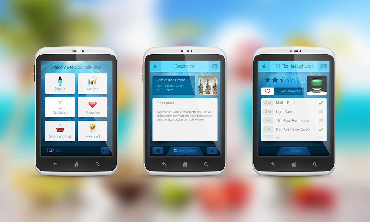
Cocktail-Making Assistant App re-design
Vous souhaitez remporter un projet comme celui-ci ?
Ce client a reçu 59 designs application de la part de 9 designers. Il a choisi ce design application de Fuxxo Works comme design gagnant.
Inscrivez-vous Trouvez des Projets de Design
- Garanti
-
 €320
€320
-
 59 designs
-
 9 designers
Brief de Design Application
Ok boys and girls, here's the deal:
I have an android app which is almost complete, but needs a design overhaul.
The app is a standard cocktail-making assistant: gives you a list of cocktails and the ability to see which cocktail you can make out of those ingredients (drinks, fruit, etc) you have at home.
I've attached some general app flow, as well as detailed requirements/explanation presentation. Most of those things are just FYI, so that you know what it's about.
3 screens are the most important (main screen, cocktail view screen, ingredient view screen), meaning I will pick the design mostly based on ideas for those 3 things, with the fourth being a rather simple list (given on attached flow, third tier)
Some other screens are derived from that, with some minor changes on it, but you shouldn't care about that.
There are lots of other, non-explained things which I said nothing about only because they are (from design point of view) completely the same and would only make it seem more complicated.
I don't want to influence the colour scheme, but the app will be released under BlueLime developer name (having a light colured blue lime as a logo) so I suppose some brownish design, for example, will not really fit nicely. If you, however, have a killer which you are confident will prove me wrong, I'm looking forward to seeing it!
It should be a serious, elegant look (as opposed to cartoonish, but we are not aiming for a business look at all!), not cluttered with details, no clubbing themes, glitter and so on.
Test apk file available on request (Android 2.3+).
Edit: payment is now guaranteed
Also please note that currently, the favorite, "heart" button has a motion effect:
on click it flies out of the screen to the left (white heart) and comes back to the screen as a red heart. Take that into consideration, if it means anything to you.

Mises à jour
Project Deadline Extended
Reason: Some designers are enthusiastic but will need an extra weekend to polish their ideas.
Added Friday, June 28, 2013
Marché(s) Cible(s)
Whoever you imagine would enjoy drinking cocktails
Secteur / Type d'entité
Business
Aspect
Chaque curseur illustre les caractéristiques de la marque client et le style que doit transmettre votre design de logo.
Élégant
Audacieux
Léger
Sérieux
Traditionnel
Moderne
Sympathique
Professionnelle
Féminin
Masculin
Coloré
Conservateur
Économique
Haut de gamme
Exigences
Doit avoir
- Everything is said in the provided documentation - images say more than I could possibly write here.
Bien d'avoir
- As said, most of the icons are a nice-to-have. Only those which are critically linked to the rest of the design must be provided. More details in the docs.
Ne doit pas comporter
- No cartoon look, No zillion colours
