A website where experts collaborate on your project
Vous souhaitez remporter un projet comme celui-ci ?
Ce client a reçu 69 web designs de la part de 7 designers. Il a choisi ce web design de Donn Marlou Ramirez comme design gagnant.
Inscrivez-vous Trouvez des Projets de Design- Garanti
-
 US$185
-
 69 designs
-
 7 designers
Brief de Web Design
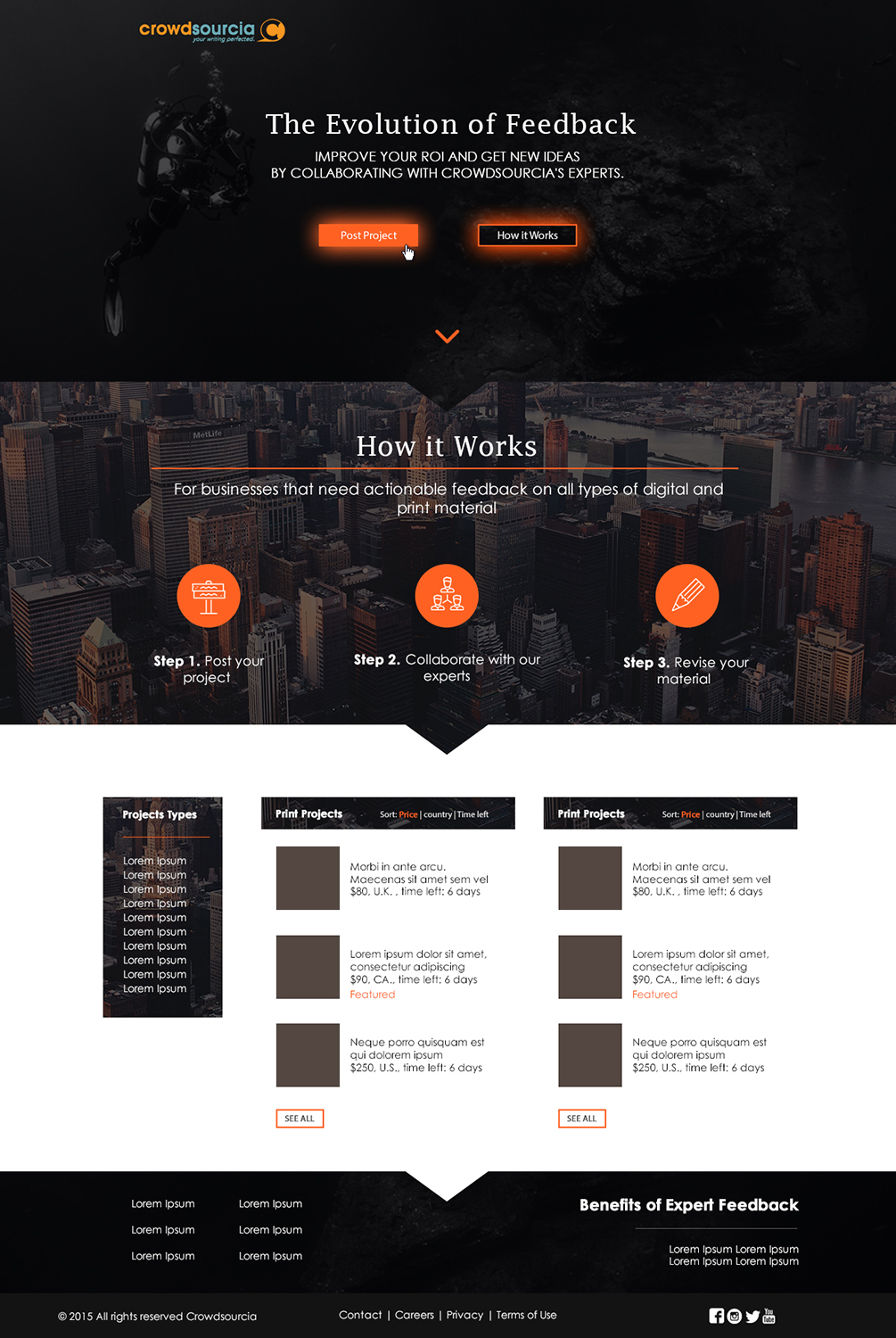
I am building a new website where experts (yes, like designers) collaborate on projects with the project owner. More minds = more collaboration = better end product. Please see Crowdsourcia(dot)com for a quick landing page I created for collaborating on presentations (although there will be many project types offered)
I am looking for a DESIGNER LONG TERM, but for now, just need initial mock ups to show the web programmers.
I have 21 Word documents loosely designed, what I would like to see here is a theme. Please DO NOT GO OFF WHAT YOU CURRENTLY SEE AT CROWDSOURCIA. What is up now is only a quick landing page.
You can view a Word doc of the homepage here:
https://www.dropbox.com/s/wb6bwxdl5g2o99m/home.docx?dl=0
WHAT AM I LOOKING FOR?
A clean, well designed theme.
Here is a link to the logo:
https://www.dropbox.com/s/2lnkgg12t03f8sc/logo%20-%20horizontal.tif?dl=0
-----------------------------------------
Here are a few sites I like the design of and what I like about them:
www.triplelift.com-all around my favorite, beautiful graphics, clean layout, bold use of colors on a dark background
Lithium.com- clean layout, The use of humans and bubble style elements.
Designcrowd.com :) clean, bold, unique pop art style but professional
writeraccess.com - From the unique colors and artwork and the ability of that art to not interfere with the important elements of the site
growthgeeks.com-clean, nice colors, well organized and separated sections.
www.stollerusa.com-love the font, use of colors and sectionalized style
-----------------------------------------
All in all, I am not picky and open to so many styles. I would ultimately like the designer I pick to design all 21 pages.
Mises à jour
Hello everyone,Moving forward, I would like you all to pay special attention to the section in my brief titled "Here are a few sites I like the design of and what I like about them". Please see below, I handpicked each one of these as sites I really like. Thank you.Here are a few sites I like the design of and what I like about them:Lithium.com- clean layout, The use of humans and bubble style elements.Designcrowd.com :) clean, bold, unique pop art style but professionalwriteraccess.com - From the unique colors and artwork and the ability of that art to not interfere with the important elements of the sitegrowthgeeks.com-clean, nice colors, well organized and separated sections.www.stollerusa.com-love the font, use of colors and sectionalized stylewww.triplelift.com-beautiful graphics, clean layout, bold use of colors----------------------------------------- Added Tuesday, November 24, 2015
I updated the homepage, you can see it here:https://www.dropbox.com/s/kwlkbsookq3cg2m/1new%20homepage.docx?dl=0I am modeling it after my favorite designed site: triplelift.comI love the dark colors with the orange glowing style boldness of the buttons. It's real clean too. Added Tuesday, November 24, 2015
Marché(s) Cible(s)
small business owners, marketers, freelancer writers, graphic designers,
Secteur / Type d'entité
Building
Nombre de Pages Demandé
5+ page
Aspect
Chaque curseur illustre les caractéristiques de la marque client et le style que doit transmettre votre design de logo.
Élégant
Audacieux
Léger
Sérieux
Traditionnel
Moderne
Sympathique
Professionnelle
Féminin
Masculin
Coloré
Conservateur
Économique
Haut de gamme
Exigences
Doit avoir
- I can't think of anything the project must have.
Bien d'avoir
- WHAT AM I LOOKING FOR?
- A clean, well designed theme. I had a designer do a bit of work putting elements together, I found it to be very plain, but I like the Application Page (https://www.dropbox.com/s/92fcmijd7a676kh/Crowdsourcia-Website.ai?dl=0)
- Here is a link to the logo:
- https://www.dropbox.com/s/2lnkgg12t03f8sc/logo%20-%20horizontal.tif?dl=0
- Here are a few sites I like the design of and what I like about them:
- Lithium.com- clean layout, The use of humans and bubble style elements.
- Designcrowd.com :) clean, bold, unique pop art style but professional
- writeraccess.com - From the unique colors and artwork and the ability of that art to not interfere with the important elements of the site
- growthgeeks.com-clean, nice colors, well organized and separated sections.
- www.stollerusa.com-love the font, use of colors and sectionalized style
- www.triplelift.com-beautiful graphics, clean layout, bold use of colors
- -----------------------------------------
Ne doit pas comporter
- out of the boxed, templated style website. I want this site to be memorable and not look like a thousand others