Logo for a fun-loving, modern and personal software engineering company
Vous souhaitez remporter un projet comme celui-ci ?
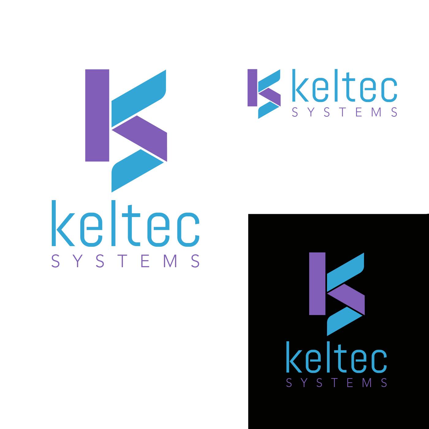
Ce client a reçu 363 designs de logo de la part de 119 designers. Il a choisi ce design de logo de Thomas DeHart comme design gagnant.
Inscrivez-vous Trouvez des Projets de Design- Garanti
-
 £170
£170
-
 363 designs
-
 119 designers
Brief de Design de Logo
We need a logo design for a software engineering firm that is based in the United Kingdom. We develop mainly business to business applications for the web and native desktop applications, but we also develop for private contracts.
We're a fun-loving, modern company with a love for cheek. We would like to see a logo that is predominantly shades of blue and white (feel free to add hints of other colours to break it up, or change the palette completely), but if you can come up with another colour scheme that looks good, feel free to submit it.
The logo should be flat, minimalistic and easy to recognise. We are happy to consider both icon logos as well as logos predominantly based around text. Please include a version with applicable typography along with the logo if you are creating an icon logo.
Words we have come up with to convey what we would like are fluid, water, splash, liquid, earth, vibrant, soft, rounded, modern. Something that looks like fluid, a teardrop, a splash etc are something we initially thought would look nice. We have seen some "sharp" concepts that are also fantastic, so don't feel constricted by this. Please don't get too invested in these words, we love abstract shapes and designs, merely use this words to assist your own creation.
If you have any other ideas that you'd like to pitch before you design it, just leave a comment :-)
**Please don't include mockups of other products. Whilst it may be used in print in the future, this logo is predominantly for web (& business cards, letterheads etc)**
Mises à jour
I have decided to increase the prize by £50 to a total of £170GBP, to say thank you for how much effort you have all truly been putting in to these designs so far :-) Added Thursday, November 19, 2015
I'm very sorry to anyone who has been awaiting feedback on their designs for the past few days. Unfortunately due to some unforeseen circumstances, we had been unable to take the time to come on and provide more feedback. We will be making our decisions based on the designs submitted by the deadline today.
Added Thursday, December 3, 2015
Marché(s) Cible(s)
Our customer base is extremely varied, we'd like it targeted to the younger generation (18-35)
Secteur / Type d'entité
Software
Texte du logo
Keltec Systems
Styles de logo qui vous intéressent
Logo d'Enseigne
Logo contenu dans une forme
Logo pictural
Un objet réel (texte facultatif)
Logo abstrait
Conceptuel / symbolique (texte facultatif)
Logo de Lettermark
Acronyme ou logo texte (texte seulement)
Styles de police à utiliser
Couleurs
Couleurs choisies par le client et à utiliser dans le design de logo:
Aspect
Chaque curseur illustre les caractéristiques de la marque client et le style que doit transmettre votre design de logo.
Élégant
Audacieux
Léger
Sérieux
Traditionnel
Moderne
Sympathique
Professionnelle
Féminin
Masculin
Coloré
Conservateur
Économique
Haut de gamme
Exigences
Doit avoir
- An icon logo (If submitting a typography based logo, this must be accompanied by something that can be used as an icon logo, such as a condensed version)
- 'Flat' design, minimalistic and memorable
- The logo must be unique and distinctive
Bien d'avoir
- A blue, purple and white colour palette, but feel free to get creative. Whilst I'd like blue, purple and white to be the dominant colours, please add hints of others (if it fits). We've had concepts drawn up in the past that used completely different palettes that were fantastic, even grayscale can be nice in the right setting, please don't feel constricted with colours.
Ne doit pas comporter
- "Angry" colour palette
- Script or decorative typography