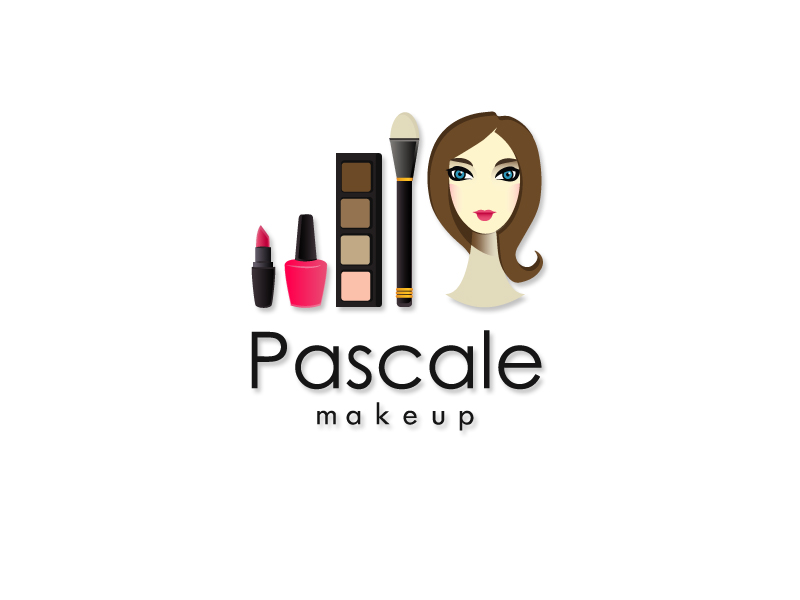
Pretty Logo Design for Makeup Artist's Blog
Gagnant
Vous souhaitez remporter un projet comme celui-ci ?
Ce client a reçu 77 designs de logo de la part de 21 designers. Il a choisi ce design de logo de Ronny Bronco comme design gagnant.
Inscrivez-vous Trouvez des Projets de Design-
 £150
£150
-
 77 designs
-
 21 designers
Brief de Design de Logo
I am a London based makeup artist looking for a logo design for my new blog. The name of the blog is 'pascale makeup'. The whole feel of the blog will be girly and floral. The overall look should be pretty using muted colours such as dusty pink, pale green, lilac etc
Marché(s) Cible(s)
women in their 20-30's, mothers with money to spend, women who travel, girly girls
Secteur / Type d'entité
Floral
Texte du logo
pascale makeup
Aspect
Chaque curseur illustre les caractéristiques de la marque client et le style que doit transmettre votre design de logo.
Élégant
Audacieux
Léger
Sérieux
Traditionnel
Moderne
Sympathique
Professionnelle
Féminin
Masculin
Coloré
Conservateur
Économique
Haut de gamme
Exigences
Doit avoir
- I would like a logo which shows both words and pictures, i absolutely love the example called 'tayologie' which I have attached, especially the way it combines the name and the flowers. I would like the shape of the logo to be a circle with 'pascale' along the top half of the semi-circle and 'makeup' on the bottom half of the semi-circle. The font should be informal and should look like cursive writing.
Bien d'avoir
- Obviously I love flowers, especially if they have a vintage vibe (see attached examples). I also love things which are hand drawn, please see attached examples. Hand drawn makeup related items would be fantastic - lipsticks, mascara wands, power puffs. I seem to have two ideas (the floral vs the hand-drawn makeup tools) so i'm not sure how to blend the two or whether to just pick one theme and run with it. A website that I love the colours and font design of is belleandboo.com which is for children, but it has the vintage vibe and colour scheme I am after.
Ne doit pas comporter
- Nothing serious or corporate or too slick. Nothing that is just black and white. Nothing that is text only. No boring fonts such as times new roman.
So far 99% of the submissions I have received are not using anything like the colours I had in mind. The colour scheme should be almost identical to the second file I have uploaded which is a scan of some floral wrapping paper. No fluro purples, lim greens etc please!
Fichiers
Télécharger tous les fichiers - 20,1 MBJPG
IMG_2764_964415 Friday, 14 June 2013 12:45:16
vendredi 14 juin 2013
JPG
IMG_2765_660321 Friday, 14 June 2013 12:46:13
vendredi 14 juin 2013
JPG
IMG_2766_354037 Friday, 14 June 2013 12:46:36
vendredi 14 juin 2013
JPG
IMG_2767_398617 Friday, 14 June 2013 12:47:12
vendredi 14 juin 2013
Paiements
1e place
£150