Retail & Restaurant co-branding concept logo
Vous souhaitez remporter un projet comme celui-ci ?
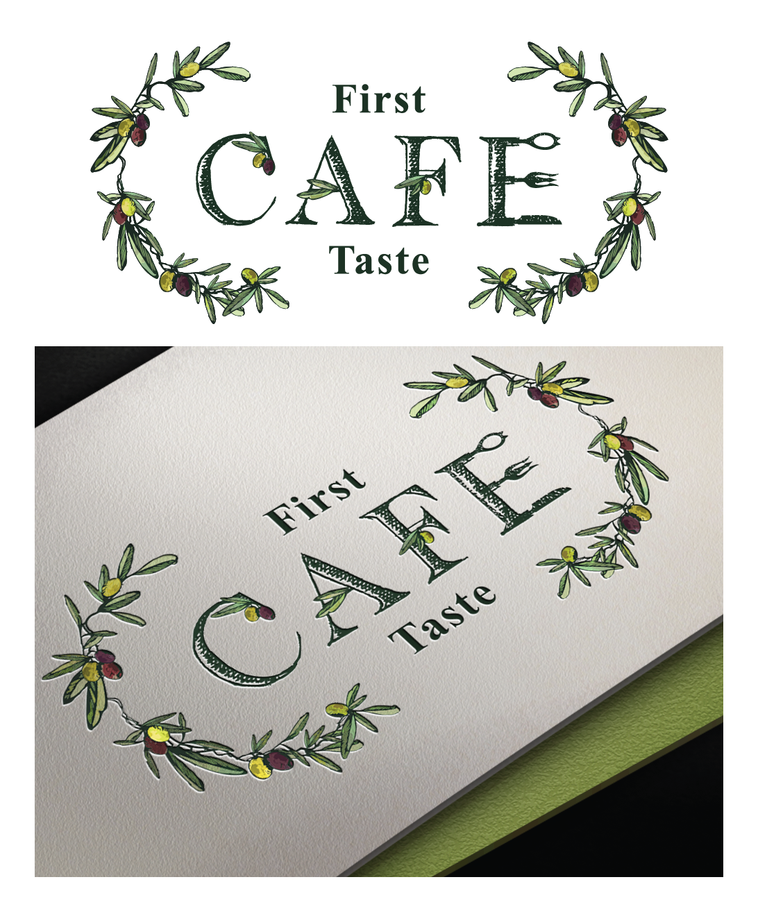
Ce client a reçu 176 designs de logo de la part de 24 designers. Il a choisi ce design de logo de Elza comme design gagnant.
Inscrivez-vous Trouvez des Projets de Design-
 US$160
-
 176 designs
-
 24 designers
Brief de Design de Logo
We are an Ultra premium Olive Oil and Vinegar Retail store with an established logo that has expanded with a Cafe (restaurant) inside the retail store. The Cafe serves modern International food in a relaxed restored historic building that incorporates the products available for retail. Our tableside service directs the guests to "play" with their food by seasoning and garnishing with the Oils & Vinegars. We would like to see designs that demonstrate a connection between the retail and Cafe but allows the Cafe to stand on it's own with a logo that is more suited for restaurant and not retail.
Mises à jour
Project Deadline Extended
Reason: Working on some revisions with in the designs submitted
Added Friday, May 20, 2016
Marché(s) Cible(s)
25+, health conscious, eats out regularly, destination oriented
Secteur / Type d'entité
Restaurant
Texte du logo
First Taste Cafe
Styles de logo qui vous intéressent
Logo d'Enseigne
Logo contenu dans une forme
Logo pictural
Un objet réel (texte facultatif)
Logo abstrait
Conceptuel / symbolique (texte facultatif)
Logo de figurine
Logo avec illustration ou personnage
Logo de Lettermark
Acronyme ou logo texte (texte seulement)
Styles de police à utiliser
Autres polices appréciées:
- ereshkigal
Aspect
Chaque curseur illustre les caractéristiques de la marque client et le style que doit transmettre votre design de logo.
Élégant
Audacieux
Léger
Sérieux
Traditionnel
Moderne
Sympathique
Professionnelle
Féminin
Masculin
Coloré
Conservateur
Économique
Haut de gamme
Exigences
Doit avoir
- See attached sketch and images. An Olive spoon & fork are attached along with two separate ideas for logo. The first one is the Olive spoon that should appear to be engraved with "First Taste" using the font supplied (Ereshkigal) with "Cafe" in the spoon opening. An olive branch for the handle. The second concept is drawn out with olive branches, olives and "first taste" incorporated into the letters. Style should be either a water color, portait or illustrative style. We would like to see both of these interpreted.
Bien d'avoir
- something besides an olive that is over used for this concept like an olive oil tasting glass
Ne doit pas comporter
- The same font used in the Retail logo