Advertisement Design Project
Vous souhaitez remporter un projet comme celui-ci ?
Ce client a reçu 43 designs de publicité de la part de 7 designers. Il a choisi ce design de publicité de jgeoinbox comme design gagnant.
Inscrivez-vous Trouvez des Projets de Design- Garanti
-
 US$200
-
 43 designs
-
 7 designers
Brief de Design Publicitaire
Color ad to be place in local newspaper. Vertical rectangle approx. 6" x 4". I would like large picture in background. Either attached raindrop image or I'm open to other suggestions. Would like to keep text simple to not detract too much from photo. Needs logo, small picture and name of Dr. Nils Ohlsen and the following: State-of-the-art Technology, Helping the Spokane Valley see better since 2000, Located in the Spokane Valley Walmart, www.outlookeye.com, 509-926-0667.
Mises à jour
Missing images added.
Added Wednesday, June 05, 2013
I would like a simple, modern look. Can eliminate 'State of the......" and "Helping Spokane Valley see...." and replace with Since 2000. Head and shoulders shot of Dr. Can experiment with other backgrounds.
Added Thursday, June 06, 2013
Actual measurement of ad will be 3.225" wide x 5" tall.
Added Thursday, June 06, 2013
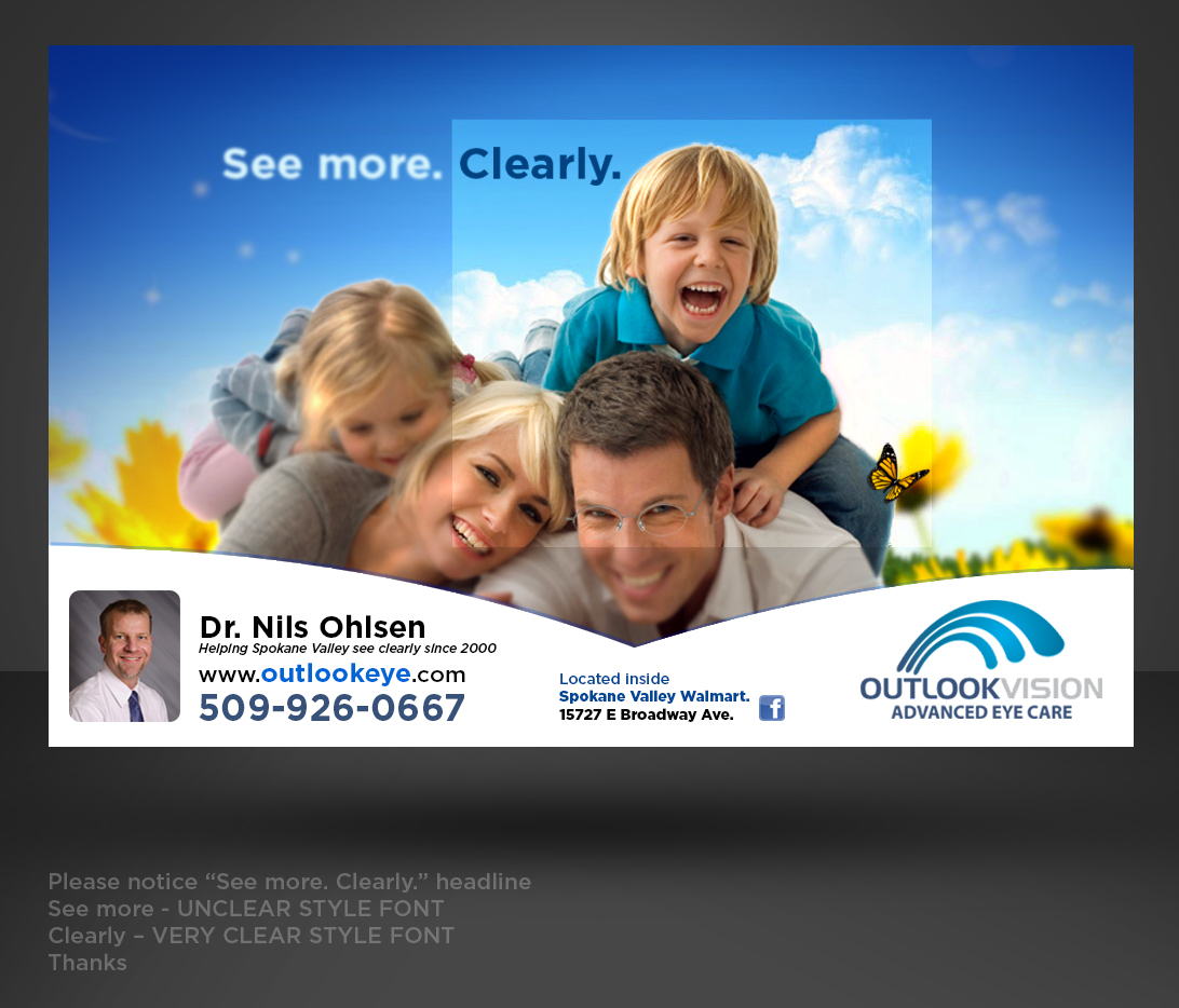
I'm not sure that my original concept was a very good one. I am open to suggestions. While I do very much like the image of the drop on the leaf, I don't know that it makes people think of eye care. On my web site at outlookeye.com I have a photo of a smiling family, one of them in glasses. We have a slight blur, with a clear square with the text, See more. Clearly. I think I would like to keep with this same concept for a horizonal rectange ad. I attached the image, file#3. On of the main reasons for this ad is because there are several other eye care places in town with a lot of turnover of the Drs, and I want to advertise that I've been here a long time. I do like the phrase, "Helping Spokane Valley see better since 2000" if that can be included effectively. Image of Dr to be included if it works okay, head and shoulders, not too large.
Added Friday, June 07, 2013
If using image of family (#3), please also use See more. Clearly, in a similar way as it is used on my web site.
Added Saturday, June 08, 2013
Shape can be vertical or horizontal, whichever would work best.
Added Saturday, June 08, 2013
Marché(s) Cible(s)
Primarily women, aged 30-50.
Aspect
Chaque curseur illustre les caractéristiques de la marque client et le style que doit transmettre votre design de logo.