Create a piece of Developer Porn
Vous souhaitez remporter un projet comme celui-ci ?
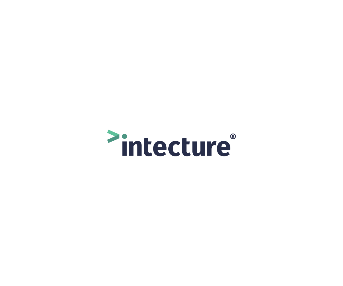
Ce client a reçu 247 designs de logo de la part de 52 designers. Il a choisi ce design de logo de Tishert comme design gagnant.
Inscrivez-vous Trouvez des Projets de Design- Garanti
- Projet Lié 1
-
 £240
£240
-
 247 designs
-
 52 designers
Brief de Design de Logo
We need a logo for our new product, called Intecture. Intecture is a systems management tool for developers. In other words, you can build lots of servers automatically with a bit of code, instead of configuring them all by hand! See https://intecture.io for more details.
Intecture differentiates itself from the competitors by embracing existing standards, rather than inventing its own. This makes it much more accessible for developers to pick up without needing a lot of non-transferrable skills.
A few likes:
* I like a great font. Fira Sans (https://github.com/mozilla/Fira) is lovely, or something equally minimal.
* I'm a big fan of lower case...and it's "intecture" with an "i", not an "L"!
* I usually lean towards minimal designs that express a single idea well, rather than something busy.
Mises à jour
G'day guys,
Thank you so much for all the designs that you've submitted so far! I just wanted to update everyone on some of my emerging preferences, having seen a lot of different ideas:
- I don't like globe themed logos. They don't look bad per se, though it's not the right image for my product. When I think of globes I think of communications and marketing. My product is a technical product for technical people. It should look slick and subtle. The brand "intecture" is more important than any logo. Check out Docker, GitHub, VMware, Chef, Puppet or a plethora of other tech brands. The one thing they all have in common is the NAME of the product featured heavily. Developers talk a lot about the technologies they have experience with, thus the name is the thing that is communicated, rather than a logo.
Having said that, a subtle logo is great and can help enhance visual communication, though it's very much secondary to the main brand. Seeing Docker's whale logo reminds me of what it is, but I'll always know Docker as "DOCKER", rather than the blue whale :)
- I like black (or dark grey) logos with a feature colour. Generally I'm not keen on branching out from that as I want the typeface to be pure and not get distracted with lots of colour.
- The best logos aren't trying to do very much. They have a really simple idea and a clear typeface. A subtle play on the dot above the "i", or something that reflects the connectedness of 'things' is ideal. Please do try and prove me wrong by doing something completely different, but for now that's what is jumping out at me.
Cheers,
Pete.
Added Saturday, October 10, 2015
Marché(s) Cible(s)
Software developers
Secteur / Type d'entité
Information Technology
Coordonnées pour la Carte de Visite
On the front, logo + strap line: "Language agnostic, DSL-free, mercury free systems management for developers"
On the back, the website: "intecture.io"
Texte du logo
intecture
Styles de logo qui vous intéressent
Logo abstrait
Conceptuel / symbolique (texte facultatif)
Logo de figurine
Logo avec illustration ou personnage
Logo mot symbole
Logo (texte seulement)
Logo de Lettermark
Acronyme ou logo texte (texte seulement)
Styles de police à utiliser
Aspect
Chaque curseur illustre les caractéristiques de la marque client et le style que doit transmettre votre design de logo.
Élégant
Audacieux
Léger
Sérieux
Traditionnel
Moderne
Sympathique
Professionnelle
Féminin
Masculin
Coloré
Conservateur
Économique
Haut de gamme
Paiements
Total
£240
Date limite du projet
24 oct. 2015 10:52:32 UTCOptions du projet
Projet(s) Lié(s)
- offrant un design de carte de visite de £60 au gagnant