Web Design Project
Vous souhaitez remporter un projet comme celui-ci ?
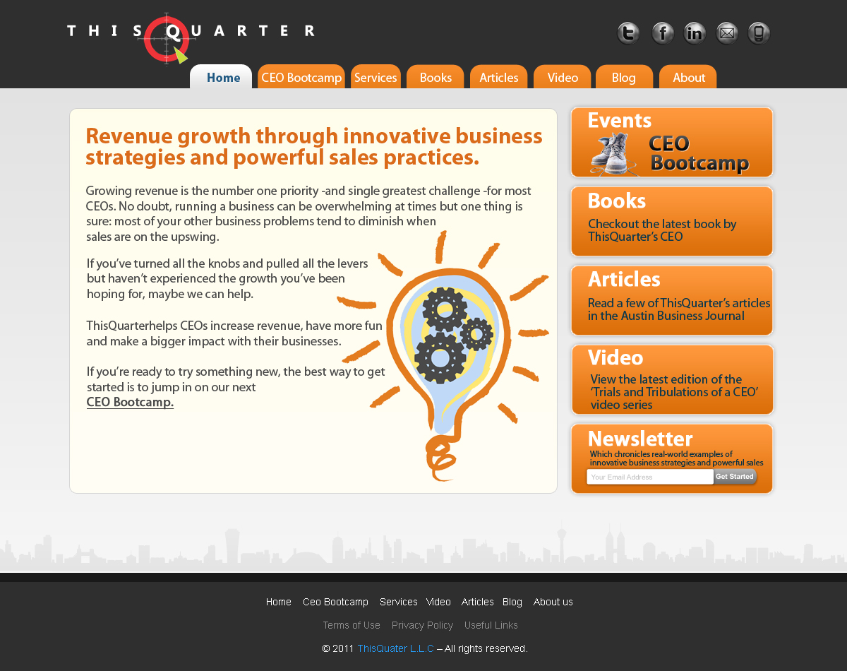
Ce client a reçu 34 web designs de la part de 8 designers. Il a choisi ce web design de MiNdfr34k comme design gagnant.
Inscrivez-vous Trouvez des Projets de Design- Garanti
-
 US$400
-
 34 designs
-
 8 designers
Brief de Web Design
We need a fresh web design for www.thisquarter.com. The current website is boring and plain. We are looking for something that jumps out at people. The structure of the site, the overall message and the packaging of our services is changing and the site needs to reflect this change. The key thing to know is our company helps CEOs increase their revenue by helping them develop more innovative business strategies and implementing powerful sales practices. We provide workshops, consulting engagements and sales training. The attached PDF contains the content I would like on the home page as well as what the top level navigation would look like. Some of the text might change a little but it is close enough. I've attached a white version of my company logo, a black version of the logo, my book cover graphic (you can crop out just the front cover) as well as the logo for the business journal I write articles for. Feel free to make any suggestions you would like. I'm open to anything! I’m tired of boring, predictable, safe, professional websites. I'm also open to different colors. People tend to use red when they design stuff for me since part of the logo has red...that’s fine but I'm also interested in seeing if other colors will work. I like websites with a lot of “free space” on the page and prefer all the content on the home page to be visible without scrolling. I use a platform called Weebly (www.weebly.com) to manage the content and host the site so you would need to give me the final graphics in a way that I can drop them into the site.
Mises à jour
Project Deadline Extended
Reason: I am extending the deadline to provide the designers more time to refine their ideas. Many of the designs that were submitted have the following issues:
1. the look and feel of the designs are too generic looking, they look like templates I could download rather than specifically designed with my company in mind.
2. some of the designs use the content from the old website. Do not use any content from the old website. I only want the content that is in the PDF that is attached to this project.
3. some of the designs have content that doesn't have anything to do with my business.
4. no stock photos please. We don't want a photo of a person on our site and especially not someone who doesn't work for our company.
5. the designs need to have more edge to them...this is your chance to be creative. The site doesn't need to look so traditional/professional. Have some fun.
6. the number 1 action we want people to take is to sign up for the CEO Bootcamp. So try to elevate that. The Dashboard Selling book, ABJ Articles and Video are credibility builders to give people confidence to sign up for the CEO Bootcamp.
7. Thank you for all your hard work...I'm excited about getting a fresh new site that really jumps out.
Added Monday, August 15, 2011
Just wanted all of you to know that I will review the final designs on Monday and make a decision. Sorry for the delay...I didn't realize the close date fell on a Saturday. Thanks for all of the great ideas.
Added Monday, August 22, 2011
I wanted to say thank you to all of the designers who submitted projects. We've completed our review and know which designs are closest. So we will narrow the remaining designs by eliminating some of the designs now. Thank you again for your hard work.
Added Monday, August 22, 2011
Project Deadline Extended
Reason: Extending the deadline to allow time for final updates to be made to designs.
Added Saturday, August 27, 2011
We extended the deadline. Following are some key points on what we are looking for in the design:
1. look and feel should be creative, different and casual but still professional.
2. website visitors should get the sense of "innovation" and "execution". As you can read in the opening sentence of the home page, we help companies grow through "innovative business strategies and execution of powerful sales practices. The website needs to communicate these ideas. Images that communicate these ideas would be helpful. Illustrations may work better than photos because they provide a more relaxed and casual look and feel.
3. Our clients are CEOs of small to midsized businesses. So, it needs to be different enough to get their attention while still feeling reasonably professional.
Please let me know if I can answer questions.
Added Saturday, August 27, 2011
Marché(s) Cible(s)
CEOs of small to midsized businesses
Secteur / Type d'entité
Business
Aspect
Chaque curseur illustre les caractéristiques de la marque client et le style que doit transmettre votre design de logo.