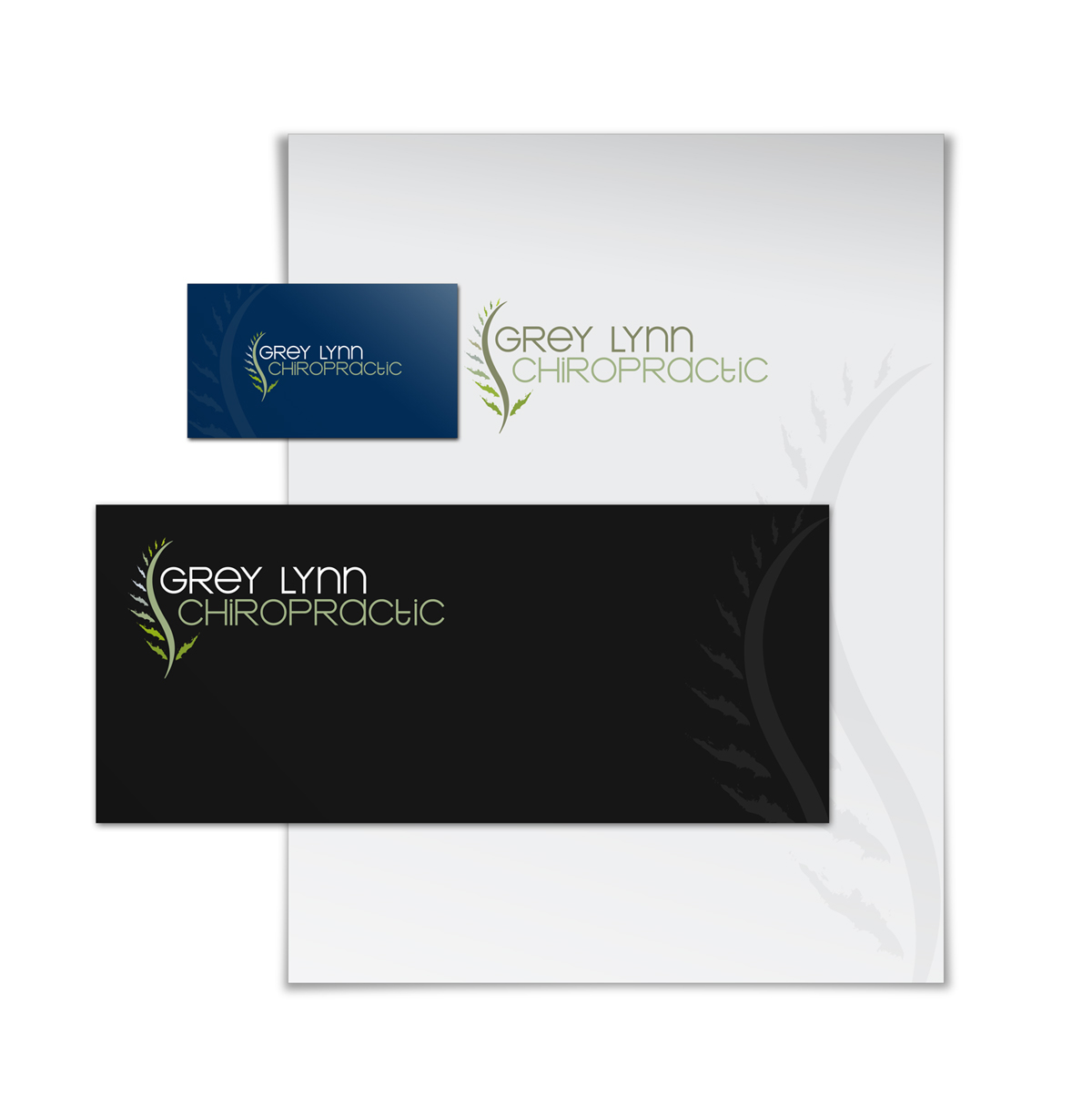
Grey Lynn chiropractic Logo Design
Vous souhaitez remporter un projet comme celui-ci ?
Ce client a reçu 70 designs de logo de la part de 22 designers. Il a choisi ce design de logo de ppnelance comme design gagnant.
Inscrivez-vous Trouvez des Projets de Design- Garanti
-
 A$200
A$200
-
 70 designs
-
 22 designers
Brief de Design de Logo
We need a logo design for a new company based in Auckland New Zealand. It is a chiropractic medical centre and we focus on healing and promoting general well being by adjusting spine subluxation and misaligned joints.
Spine and nervous system healing and adjustment are our main focus and we would like this to be showed in our logo.
please check the below website for more information about our industry and competitors.
the set up of our office is more artistic than a traditional reception area whereas you feel like you walked ina n art gallery than a waiting room.
feel free to check the attached photos eg the official symbol of New Zealand.
http://www.chiropractic.ac.nz/chiropractic-education/index.php
http://www.chiropracticfirst.co.nz/
http://www.mtedenchiro.co.nz/
http://www.aucklandchiropractors.co.nz/
http://www.chiropractictouch.co.nz/
http://www.elite-chirotables.com/associations.php
Marché(s) Cible(s)
people with back and neck pain, headache,... and we welcome with different financial status from low to high.
Secteur / Type d'entité
Industry
Texte du logo
Grey Lynn Chiropractic
Aspect
Chaque curseur illustre les caractéristiques de la marque client et le style que doit transmettre votre design de logo.
Élégant
Audacieux
Léger
Sérieux
Traditionnel
Moderne
Sympathique
Professionnelle
Féminin
Masculin
Coloré
Conservateur
Économique
Haut de gamme
Exigences
Doit avoir
- rich and darker background color is a must. Must have warm colors.
Bien d'avoir
- The use of green and blue colors. Integration of Spine and New Zealand symbol (Fern tree) would be nice to see.
Ne doit pas comporter
- Too much color, or circus like theme.