Logo for Craft Brewing Company
Vous souhaitez remporter un projet comme celui-ci ?
Ce client a reçu 34 designs de logo de la part de 12 designers. Il a choisi ce design de logo de Jace Design comme design gagnant.
Inscrivez-vous Trouvez des Projets de Design- Garanti
-
 US$500
-
 34 designs
-
 12 designers
Brief de Design de Logo
The Hipster Brewing Company is a new craft brewing company being established in the UK.
This brief concerns the design of the Hipster Brewing Company logo.
Who is the Client?
The Hipster Brewing Company is a new craft brewing company being established in the UK. We will be brewing beers primarily for the home-drinker and so the main method of distribution and packaging will be bottles.
Despite being a UK company, we will be brewing and marketing beers in a similar manner to American microbreweries such as the Stone Brewing Company, Flying Dog Ales and Left Hand Brewing. Our beers will be inspired by the styles being brewed by the American microbreweries.
We want our logo/brand to "feel" American whilst not being overtly so. There is great affection in the UK for all things American, so the logo must evoke a sense of Americana without being overly American.
Please do not use any obvious American imagery such as flags, colouration (i.e. over-use of red, white and blue - bear in mind that the British flag is also red white and blue) and no animal imagery should be used at all.
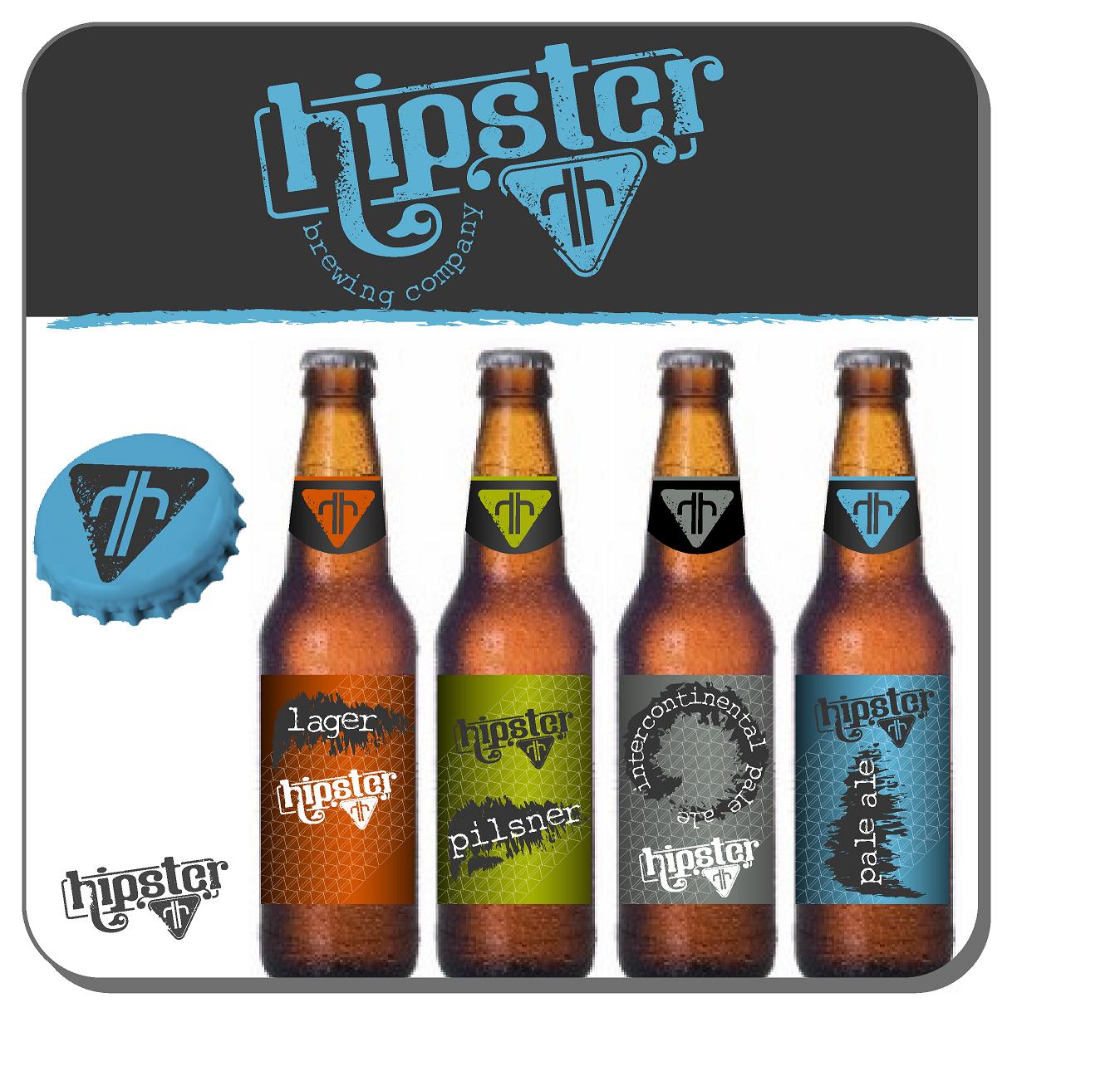
The Hipster Brewing Company logo should incorporate a central emblem/shape which can be used on bottle necks and caps in its own right.
For examples of this, please see the "B" shape used on the Brooklyn Brewery logo and how it is used on the bottle neck and cap:
http://www.brooklynbrewery.com/
The Freedom Brewery in the UK uses a six-pointed star to the same effect:
http://www.freedombeer.com/welcome.asp
Note that the Freedom Brewery does not have a distinct circular logo, per se, but does use the star to good effect.
Brewdog (another UK company) use their jumping dog emblem on bottle necks and caps:
http://www.brewdog.com/
Left Hand Brewing do the same thing with their red hand emblem:
http://www.lefthandbrewing.com/
Flying Dog Ales (http://www.flyingdogales.com/ ) have a completely separate approach where they use bespoke illustrations from Ralph Steadman on their bottles; however they do use the winged emblem on all their bottle neck stickers.
Flying Dog via their branding and website have the sort of "feel" we're looking for: punchy, irreverent, fresh, cool.
Stone Brewing Company (http://www.stonebrew.com/) use a Gargoyle sitting above the name. This is also an interesting logo, but we think the Gargoyle isn't punchy enough, however the basic style is appealing.
Most of the brewing companies referenced here use clever colouration to distinguish between their individual products - e.g. the core Brooklyn logo is white on green on black but their range of beers use different colour variations to distinguish between them.
The Hipster logo should be able to accommodate the name of the beer within the bottle (e.g. Pale Ale, IPA, or even "Intercontinental Pale Ale" which is about as long as it's likely to get).
The logo's standard text will be: Hipster Brewing Co
If a bottle contains Pale Ale, this text will change to Hipster Pale Ale, for Pilsner it will be Hipster Pilsner, for Lager it will be Hipster Lager, etc. Take a look at how the various breweries mentioned here do it.
It might actually go as far as Hipster Intercontinental Pale Ale; note that the words Intercontinental Pale Ale must appear together as they describe the product - they can be split with a line break if necessary, but cannot be separated across the logo with, for example, the word Intercontinental at the top and Pale Ale at the bottom.
Mises à jour
In case it's not quite clear, the logo will mainly be used on bottles. It will be the core logo for the company, but it will mainly be used on all packaging - the main one being, of course, bottles.
OK - call us a little bit slow if you must, but we have just learned that the word Hipster is actually a derogatory term for certain types of pretend-uber-cool geeks. We though it just sounded cool.
We're having a bit of a rethink on the name, but please proceed as planned and try not to read too much into the word "hipster". Shit.
We're sticking with Hipster. Phew.
Marché(s) Cible(s)
Customers will be discerning beer drinkers (usually male) who know a bit about different beer styles and don't mind paying a premium for better quality beers.
Secteur / Type d'entité
Beer
Texte du logo
Hipster Brewing Co
Styles de logo qui vous intéressent
Logo d'Enseigne
Logo contenu dans une forme
Logo pictural
Un objet réel (texte facultatif)
Exigences
Doit avoir
- The logo must be 100% original and must not make use of any stock imagery or illustrations.
- The logo should be eye-catching and the designer should bear in mind that this will potentially be on a shelf with dozens of other brands so the more punchy and cool, the better.
Bien d'avoir
- It would be good if the designer could demonstrate the core logo, and maybe two variations showing different colours, and the product name incorporated.
Ne doit pas comporter
- Please do not use images or illustrations of beer in glasses or people drinking beer, or any of the ingredients such as malt and hops. People will know there’s beer in the bottle.
- Please do not use images.
- Please do not use illustrations of animals or people