3D Logo Design For Construction Company- Design is almost Complete
Gagnant
Vous souhaitez remporter un projet comme celui-ci ?
Ce client a reçu 35 designs de logo de la part de 10 designers. Il a choisi ce design de logo de Javier Porto comme design gagnant.
Inscrivez-vous Trouvez des Projets de Design-
 US$160
-
 35 designs
-
 10 designers
Brief de Design de Logo
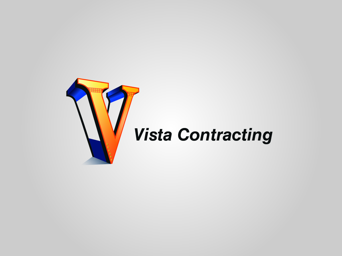
Looking for a 3D logo design for a construction company. Building homes and commercial property. I am looking for a replica of the exact copied attached with the necessary changes in the Example 2 file. This logo was almost ready to go, but the person who designed it did not want to make the minor changes. Please let me know if you can handle this project? This should look like a steel beam structure with connecting bolts.
Please see recent Vista corrections file that I uploaded and see corrections on the left V Vector.
Marché(s) Cible(s)
Home owners
Secteur / Type d'entité
Construction Company
Texte du logo
Vista Contracting
Styles de police à utiliser
Autres polices appréciées:
- Get Creative
Aspect
Chaque curseur illustre les caractéristiques de la marque client et le style que doit transmettre votre design de logo.
Élégant
Audacieux
Léger
Sérieux
Traditionnel
Moderne
Sympathique
Professionnelle
Féminin
Masculin
Coloré
Conservateur
Économique
Haut de gamme
Exigences
Doit avoir
- Necessary changes in attached example 2 file.
- The bolts on the bottom right side of the V look pixelated.
- The black line in the back of the V, connecting the top to the apex, should be parallel to the other black border.
Bien d'avoir
- A perfect and portioned design
- Please see the file latest example
- (BLUE BOX) The rivets with the beam just look like circles. I feel like previous versions they had more depth and looked more realistic. Also how I explained in the previous briefs the rivets should be on top of each other (showed example)
- (GREEN BOX) Same thing for rivets at bottom just look like circles. Same thing as I said before feel like previous versions had more depth to them and realistic looking. I feel those to things are really taking away from the whole logo that looks great right now. A lot of good graphic work to just have plain looking circles in those 2 spots.
- (PURPLE ARROW) Also just make sure they are not touching the orange border going around the V.
- (BROWN ARROWS/BOXES) I said in previous briefs and showed with my pic example the spacing between the top should be the same thickness on
- (RED ARROW) Latest I would make the thickness of the dark orange border around the V a little less thick (maybe in half w/e you think best). Want the other great graphic work to stand out.
Ne doit pas comporter
- Not matching up to the original designs, not matching up to original colors, -Rusty Orange and Blue
Fichiers
Télécharger tous les fichiers - 1,9 MBJPG
Vista Contracting Logo- 2nd (1) Monday, 31 August 2015 20:03:45
_brief310345.jpg?AWSAccessKeyId=ASIARQT47ZIUZUSIMWHZ&Expires=1774746216&response-content-disposition=attachment%3Bfilename%3D%22Vista%20Contracting%20Logo-%202nd%20%20%281%29%20Monday%2C%2031%20August%202015%2020_03_45.jpg%22&x-amz-security-token=IQoJb3JpZ2luX2VjECAaCXVzLWVhc3QtMSJGMEQCIH4T4ojBoCW%2FhLb8G5bwp8dt3R8lfwIuoMUbBsa8fAhQAiA2OQNPsj9tDs88hssck%2BHJZYYc029bXaRtblYi%2FIkYtCr0Awjo%2F%2F%2F%2F%2F%2F%2F%2F%2F%2F8BEAAaDDEwNDQxNTA4NzE0NSIME72dLA2HBSDGZCcqKsgD4VP5IMw14iXOJ7NVaDxt%2FAlI2LTP0mxmkV9OHh%2BI%2B8%2BuD3h9UCJuawX2mi13WlpCe%2Fal0QbB9Bve9fTxg50VZ2xpV%2B3YMZnI4ZEoPZNxWKD6IELXsoWqED8E04zp2akzJQaGqIBZ0zir4BqyPF808KdMiUuIosTvH64xX2QWTVsUm5X3pvqWjXoY%2BHW3587AHQUy3PMnFn1Yb3BU4mcFqVqfOFXn7z5z%2FSUQsRKLzbi6HGLTp9mY%2FT74gM60PJiSAzG7jhQzC9JFFZ%2BGgT%2Blp3I1COVQ2y1wW6nPbmMGbMe0GrcdRlAoKs4iEXBfTDDcklYKV60cWFVv3mb5ZLZtKO5xz2CZvaD7rapViDr7YQDTPl4o2xdF%2FLhoDgU61TZRdCMGi2o3rU9BG7%2BmKU67T5aOgKThkjAoMMh4QMntiNeBuJQtaQs4VqERmtLHMxPdPq%2FbOoIB8c9EAHmucYGf6U8bYdXMqN%2BCtAVDUOoVThZySwTdHjXOJhRA4msL%2Fxwkg3U5G4xT2Br7Lie%2BoxkCZPGNVYdi7XXvIhzzxgVLVHi2hqEJvAmShp%2F0jwX6wZBaSDFH1sdyJyLD%2Fxl7E9ux2Ql8HSJvBMdbML2dnM4GOqYBnGowAeCYep2lLb9%2Fs5dptt1KrSWvemD4uIIUYVmPeFc8KxWmZXBdizbF%2FQgdGpHg1EBaBAvzJ%2BpgaghEhC40mTjoaWXpSW1MYvLsZNHX8uEFT7SIOJ5EprbuV0f2LihH%2FOUPn5SOg6MV%2F6SUz3kGItghYuuysev8HD0r8b6I7tF3U3nI0Fnx%2BVsLZyr4IZDwzI735Ghc4EM9Um8Y57ciQxjVVXv5vQ%3D%3D&Signature=3qFujYStzUMztXZf4FllqjPEw9Q%3D)
mercredi 2 septembre 2015
PNG
Example 2 Monday, 31 August 2015 20:04:27
mercredi 2 septembre 2015
PNG
Vista-Contracting-Draft Monday, 31 August 2015 20:24:52
mercredi 2 septembre 2015
JPG
steel-structure-bolts-i-beams-landscape-background-34173589 Tuesday, 01 September 2015 00:10:02
mercredi 2 septembre 2015
PDF
img001 (1) Tuesday, 01 September 2015 11:18:04
mercredi 2 septembre 2015
PNG
Vista corrections Tuesday, 01 September 2015 11:18:53
mercredi 2 septembre 2015
PNG
Newest example Wednesday, 02 September 2015 13:56:47
mercredi 2 septembre 2015
Paiements
1e place
US$160