Wordpress Design Project
Vous souhaitez remporter un projet comme celui-ci ?
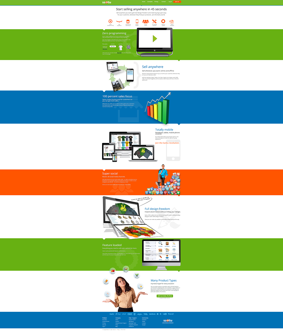
Ce client a reçu 17 designs Wordpress de la part de 5 designers. Il a choisi ce design Wordpress de Creative1984 comme design gagnant.
Inscrivez-vous Trouvez des Projets de Design- Garanti
-
 A$500
A$500
-
 17 designs
-
 5 designers
Brief de Design Wordpress
We are looking for a new design for our website - and need your help to make it great.
Our current website is here: http://www.santu.com: It has way too much information on it and it lacks a clear focus.
You can download the current design approach here: http://we.tl/vTmv14sxye
It is a layered PSD file with the various approved images for the different sections. We have also uploaded images to the project which you can use.
Please use these section images in your designs with improvement suggestions as per below.
What we still need:
Header: We are not entirely sure about the header yet - variations for this would be great.
Colour scheme: We are not sure about the colour scheme yet: if you have better ideas, please present them. May be less colours, or muted colours ?
Improvements required to section images:
Full design Freedom: The monitor with t-shirts is fine, the middle screen should be a gallery of modern watches (image provided or you can create a better one) and the fruits - image provided (see attached image Santu_site_development_blue-header)
Many product types: really only the text in the bubbles needs some improvements
Main Website Font:
The font in the supplied PSD file is a Google web font called Open Sans http://www.google.com/fonts/specimen/Open+Sans
This font is quite nice, but not so easy to read on some backgrounds. It can be replaced with a stronger font which does not look too heavy or playful.
Font for: "Click on any T-Shirt to see how it works": http://www.telegraphics.com.au/type/sketch.html. If you can think of a nicer handwritten code you are welcome - I am happy with this one.
we are also lacking the additional page designs - content, blog, contact, pricing and so on.
We are quite far down the track with this design - only participate if you think you can create a genuinely better and stronger approach.
Mises à jour
Project Deadline Extended
Reason: set incorrectly initially
Added Sunday, May 12, 2013
Project Deadline Extended
Reason: not enough submissions
Added Wednesday, May 15, 2013
Marché(s) Cible(s)
Designers and small business owners
Secteur / Type d'entité
Aspect
Chaque curseur illustre les caractéristiques de la marque client et le style que doit transmettre votre design de logo.
Élégant
Audacieux
Léger
Sérieux
Traditionnel
Moderne
Sympathique
Professionnelle
Féminin
Masculin
Coloré
Conservateur
Économique
Haut de gamme
Exigences
Doit avoir
- Home page (improvement of current approach)
Note that text and section images are approved apart from those listed above - so only create others if you can do genuinely better
content page
contact page
A better footer
blog design
pricing page
Bien d'avoir
- anything else you can come up with to make the site look more appealing and professional.
We only need designs - and layered psd files - programming will be a separate task
Ne doit pas comporter
- Photos which are TOO stock style. We use istockphoto and fotolia