

 Rafraîchir
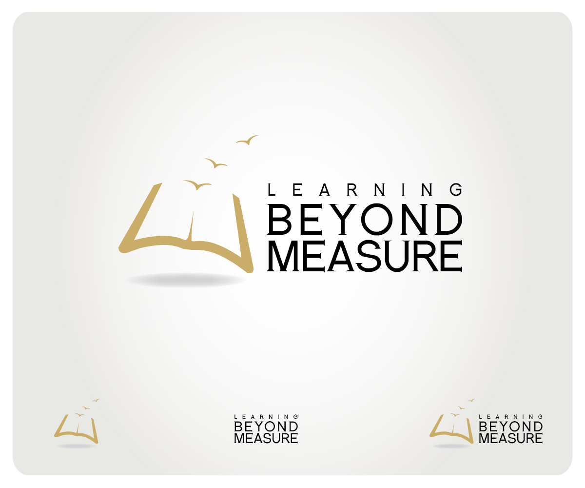
Wanted: An educational logo that communicates a love for learning.
Vous souhaitez remporter un projet comme celui-ci ?
Ce client a reçu 66 designs de logo de la part de 21 designers. Il a choisi ce design de logo de S. Bala comme design gagnant.
Inscrivez-vous Trouvez des Projets de Design
- Garanti
-
 C$265
-
 66 designs
-
 21 designers
Brief de Design de Logo
We need a logo for an educational organization that focuses on differentiated instruction and more importantly, a focus on the whole student learner and organic learning opportunities. The organization distances itself from assessment based programming, and encourages students to hold themselves accountable to learn and grow at their own individual pace.
This logo will be used for the website and print material.
We already have a recently created logo that we are working with, though we are looking for an alternative.
We looking for earth tones to be used, such as browns, greens, yellow, etc., but we can be somewhat flexible with other colours.
Designs with 'checkmarks' included will not be consi
Marché(s) Cible(s)
Educators, Elementary Teachers, Parents
Secteur / Type d'entité
Learning
Texte du logo
Learning Beyond Measure
Styles de logo qui vous intéressent
Logo pictural
Un objet réel (texte facultatif)


Logo abstrait
Conceptuel / symbolique (texte facultatif)


Logo mot symbole
Logo (texte seulement)
Styles de police à utiliser


Aspect
Chaque curseur illustre les caractéristiques de la marque client et le style que doit transmettre votre design de logo.
Élégant
Audacieux
Léger
Sérieux
Traditionnel
Moderne
Sympathique
Professionnelle
Féminin
Masculin
Coloré
Conservateur
Économique
Haut de gamme
Exigences
Doit avoir
- Easy to read.
- If the text is going to be separated in any way, the words 'Learning' and 'Beyond' cannot be grouped apart from the word 'Measure', simply because "Learning Beyond" is not a complete idea, at least not in the terms of this particular brand concept.
- Alternatively, 'Learning' could stand alone. while 'Beyond Measure' could be grouped together.
Bien d'avoir
- A simple, but meaningful graphic, embedded within the text could be nice, but unnecessary. If images of children are used, they must be racially ambiguous.
- Update:
- Because the brand strongly reflects a respect for the individual student learner, beginner from their personal experiences and starting point, I feel it would be cool to see an emblem that reflects how the perception of different individuals vary.
Ne doit pas comporter
- Cursive Print, Checkmarks, Diploma Hats, Acronyms.