Deer Valley YMCA Camp CD Package Design Project
Vous souhaitez remporter un projet comme celui-ci ?
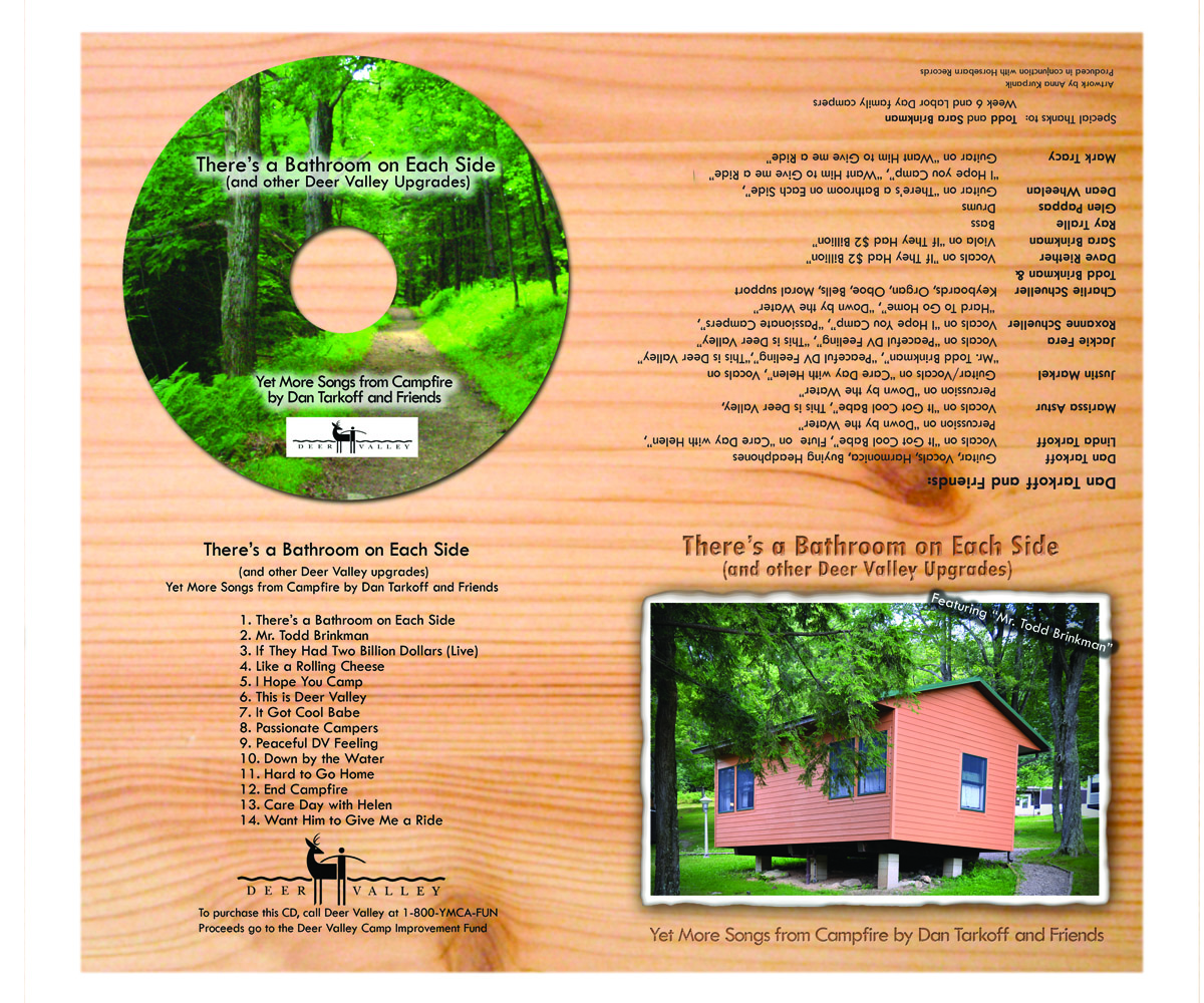
Ce client a reçu 23 designs de pochette de CD de la part de 6 designers. Il a choisi ce design de pochette de CD de Anna comme design gagnant.
Inscrivez-vous Trouvez des Projets de Design- Garanti
-
 US$310
-
 23 designs
-
 6 designers
Brief de Design de Pochette de CD
This is a fund-raising CD for A YMCA family camp. The look and feel should be outdoors, campy, woodsy, wholesome, and family in feel. The camp has approximately 60 families each week staying in cabins, eating in the dining hall and doing lots of different activities. There are 11 weeks of family camping with year round weekend activities for families.
The package consists of a CD package with 4 panels plus the CD itself. The panels are Cover, Inside left, inside right and back cover. Details, and direction for each panel is below. The templates are included as well. If you use a background texture or color for the panels, it CANNOT be red or green. These two colors were used for the previous two CDs.
Mises à jour
I posted two additional files which show the design of the previous CD. This is for reference only. The format is different.
Added Sunday, May 19, 2013
Aspect
Chaque curseur illustre les caractéristiques de la marque client et le style que doit transmettre votre design de logo.
Élégant
Audacieux
Léger
Sérieux
Traditionnel
Moderne
Sympathique
Professionnelle
Féminin
Masculin
Coloré
Conservateur
Économique
Haut de gamme
Exigences
Doit avoir
- The cover must include the "New Cabin" photo. There are 5 word docs with the required text and suggestions for content for each of the panels. There are additional photos to use if it makes sense.
Fonts should match the feel of the CD.
The front cover should have a burst indicated on the instructions for front cover.
Bien d'avoir
- I would like one of the photos to be used for the inside right panel and that same photo used and scaled back for the CD. This isn't a must have, but a suggestion.
The previous two CDs had a background texture/color that ran through the entire package. The previous colors used were Red and Green. This is not a requirement, but if it makes sense to do this, please do not use these colors.
Ne doit pas comporter
- The feel should be wholesome and not contain any materials that would be viewed as offensive or sexual in nature.