IT Business needs services diagrams turned into infographics
Vous souhaitez remporter un projet comme celui-ci ?
Ce client a reçu 15 designs infographie de la part de 5 designers. Il a choisi ce design infographie de lovelyMe comme design gagnant.
Inscrivez-vous Trouvez des Projets de Design-
 A$230
A$230
-
 15 designs
-
 5 designers
Brief de Design Infographie
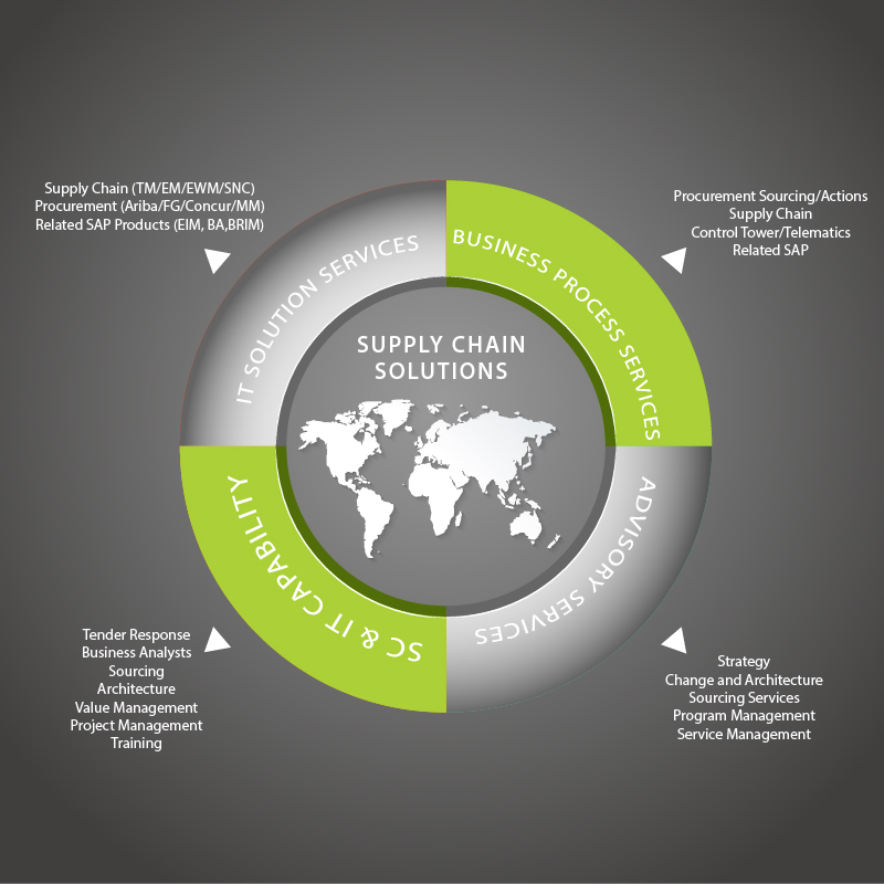
We have two diagrams that show our service categories. We'd like the content to be turned into an infographic for each diagram so that they look more modern and professional. The two infographics should have a similar design so that they can be used together. The infographics should use the content supplied in the diagrams and the corporate colours of black, grey and green as per our website www.fourpl.com.au. Attached below is the original diagrams and some infographic designs that we are currently using but we would like something new.
Marché(s) Cible(s)
Big Corporate companies
Secteur / Type d'entité
It Company
Styles de police à utiliser
Couleurs
Couleurs choisies par le client et à utiliser dans le design de logo:
Aspect
Chaque curseur illustre les caractéristiques de la marque client et le style que doit transmettre votre design de logo.
Élégant
Audacieux
Léger
Sérieux
Traditionnel
Moderne
Sympathique
Professionnelle
Féminin
Masculin
Coloré
Conservateur
Économique
Haut de gamme
Exigences
Doit avoir
- Content as per the diagrams
- Use corporate colours of green, grey and black
Bien d'avoir
- Similar style to the website style: www.fourpl.com.au
- strong lines, modern style.
Ne doit pas comporter
- nothing airy fairy,