Website for environmentally-friendly products - retail and online store
Vous souhaitez remporter un projet comme celui-ci ?
Ce client a reçu 38 web designs de la part de 6 designers. Il a choisi ce web design de Sbss comme design gagnant.
Inscrivez-vous Trouvez des Projets de Design- Garanti
-
 US$250
-
 38 designs
-
 6 designers
Brief de Web Design
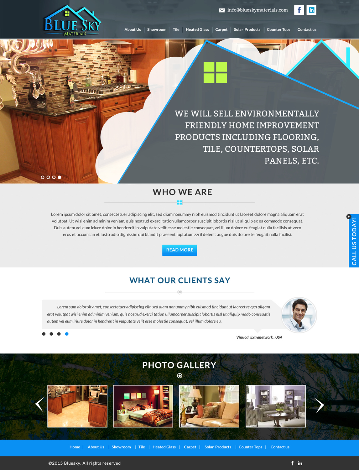
We are opening a retail store in Pittsburgh, PA named "Blue Sky Materials" which will sell environmentally friendly home improvement products including flooring, tile, countertops, solar panels, etc.
It will be a unique store to the area, selling many products that you cannot purchase in any other nearby stores.
We have a physical store, but some items can be purchased directly through the website also.
The challenge is to make the website artistic and beautiful, representative of nature, but also easy enough to navigate to be functional.
The main page should have a place to display a picture of our products
Marché(s) Cible(s)
Home owners seeking environmentally products for home remodeling projects
Secteur / Type d'entité
Home Improvement
Nombre de Pages Demandé
1 page
Couleurs
Couleurs choisies par le client et à utiliser dans le design de logo:
Aspect
Chaque curseur illustre les caractéristiques de la marque client et le style que doit transmettre votre design de logo.
Élégant
Audacieux
Léger
Sérieux
Traditionnel
Moderne
Sympathique
Professionnelle
Féminin
Masculin
Coloré
Conservateur
Économique
Haut de gamme
Exigences
Doit avoir
- I want the entire page of the site to have a picture in the background, some picture of nature. I've attached one example of a picture as if you're looking up at the blue sky through tall trees. I am NOT set on this picture. It's just one example. I'll look for others as well.
- I've attached a very quick draft of how the first page might be laid out. Our logo top left (attached that file too), phone number top right, a slider box off to the left where various pictures of our products / work will rotate. (I've attached one picture of a kitchen to use for the website example). Then, for customers to access the various pages, perhaps each product is listed within it's own leaf or it's own cloud....really unsure here if it can be pulled off without looking cheap.
Bien d'avoir
- For tabs or links to other pages, rather than having all of the plain boring tabs at the top (which are easy to navigate, but not as pretty) I'd like to experiment with having them throughout the page, perhaps congruent with whatever picture is in the background, as sort of shown in my draft attached. In my draft, I assumed the "tall trees" picture was the background. The lines drawn from the edges of the paper to the center represent the trees. And the links to our products "tile" "carpet" "countertops" sort of follow the circle of the view through the trees and are themselves perhaps on or in a leaf, or within a cloud or some other object representing nature.
Ne doit pas comporter
- Hard-to read font. With there being a picture in the background, I think the fonts should be clean and crisp - at least for the words that link to other pages (our products)