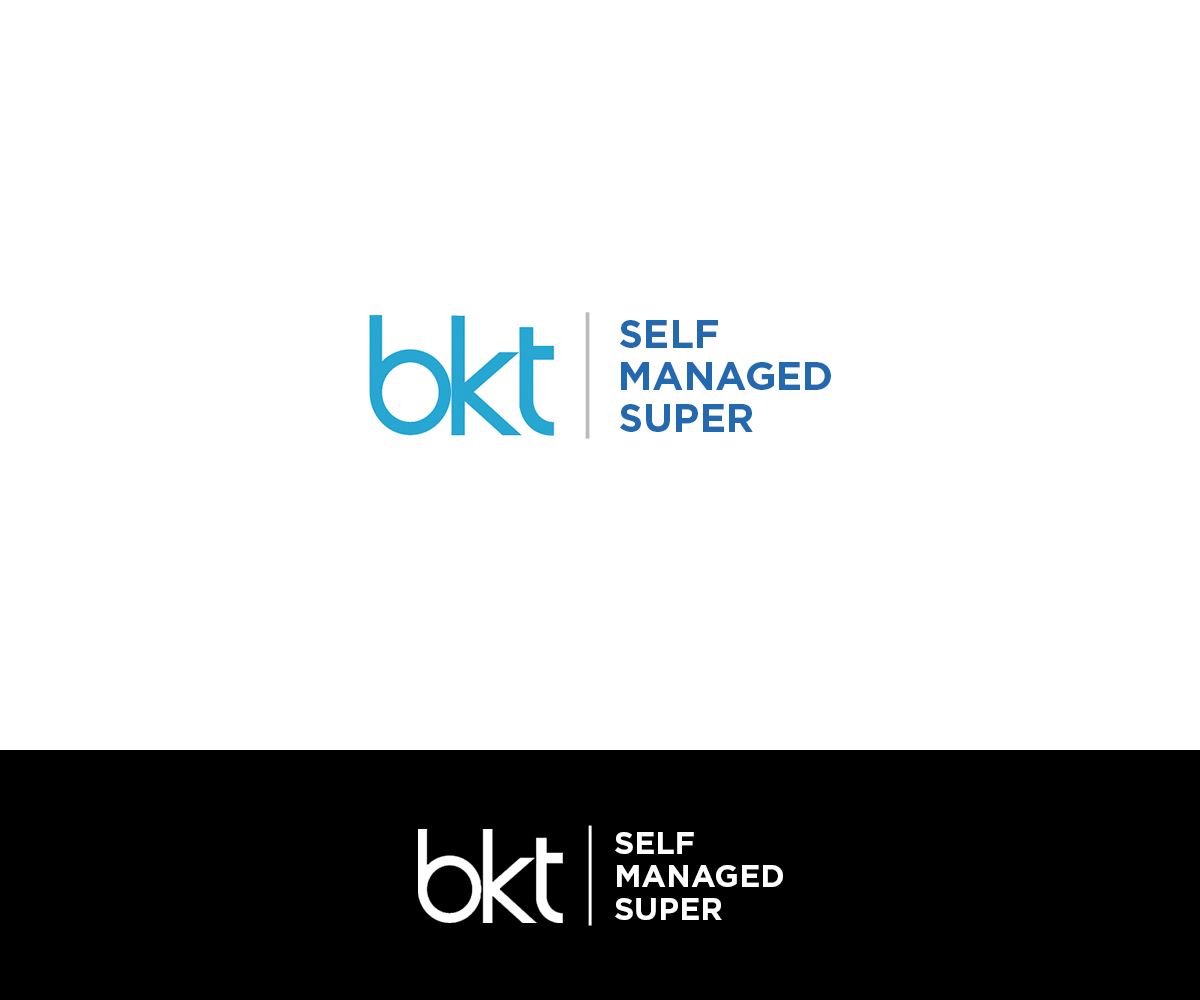
BKT Self Managed Super Logo Needs a Revamp

Vous souhaitez remporter un projet comme celui-ci ?
Ce client a reçu 88 designs de logo de la part de 43 designers. Il a choisi ce design de logo de MIND comme design gagnant.
Inscrivez-vous Trouvez des Projets de Design- Garanti
Brief de Design de Logo
We would like to redesign a logo for BKT Self Managed Super which is a financial services business based in Melbourne Australia that provides administration and advice services to people who run Self Managed Superannuation Funds. Self Managed Superannuation Funds are small, privately managed funds that hold investments for their members' retirements.
Our current logo is attached. When this was designed, our business was a division of a larger group of businesses under a broad "BKT" banner so the BKT is very dominant and "self managed super" part is understated. We would now like to give BKT Self Managed Super a stronger identity as a stand alone business by increasing the size and prominence of the "self managed super" part.
BKT Self Managed Super is a long name and we are looking for a design that arranges the words in a way that looks good and works well on letterhead and website etc.
Marché(s) Cible(s)
People from the age of 40 upwards you run their own self managed superannuation funds.
Secteur / Type d'entité
Financial Service
Texte du logo
BKT Self Managed Super
Styles de logo qui vous intéressent
Logo mot symbole
Logo (texte seulement)
Couleurs
Couleurs choisies par le client et à utiliser dans le design de logo:
Aspect
Chaque curseur illustre les caractéristiques de la marque client et le style que doit transmettre votre design de logo.
Élégant
Audacieux
Léger
Sérieux
Traditionnel
Moderne
Sympathique
Professionnelle
Féminin
Masculin
Coloré
Conservateur
Économique
Haut de gamme
Exigences
Doit avoir
- Our business is still associated with other BKT businesses and we MUST USE THE SAME FONT TYPE AND DESIGN FOR THE "BKT" LETTERS IN THE NEW LOGO AS IS USED IN THE CURRENT LOGO . The spaces between the letters could be removed or reduced if necessary. I understand that the current colour of the BKT letters is Pantone 3135. We would prefer a similar colour but one that is more blue with less green in it.
- In the new logo the "self managed super" part should also be in a blue (not grey as in the current logo) and be much more prominent in the design. However, we would envisage that the BKT characters would still be larger and more prominent than the "self managed super" characters. It is not necessary for all characters to be the same blue colour.