BoKU International New Package design
Vous souhaitez remporter un projet comme celui-ci ?
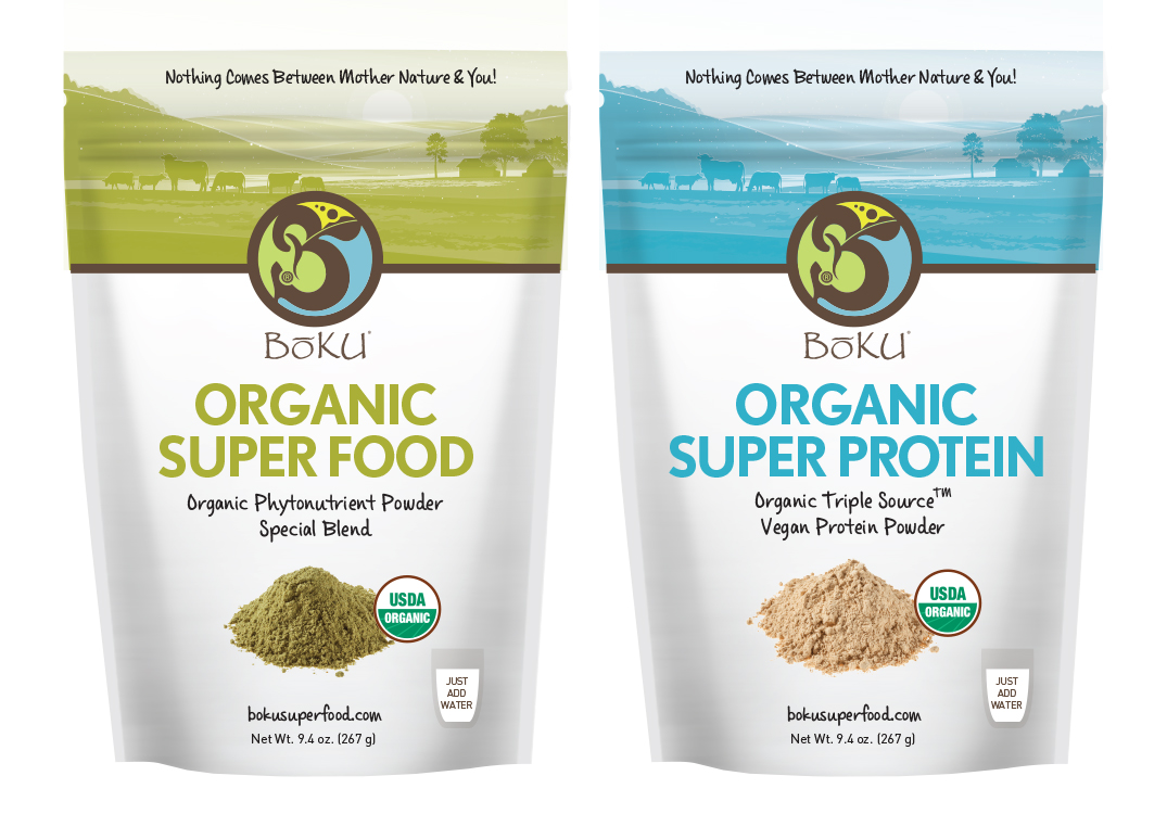
Ce client a reçu 33 designs emballage de la part de 12 designers. Il a choisi ce design emballage de Griet comme design gagnant.
Inscrivez-vous Trouvez des Projets de Design- Garanti
-
 US$375
-
 33 designs
-
 12 designers
Brief de Design Emballage
We need a new packaging design for our Super Food Company, BoKU International. We are an all organic, non-GMO company that specializes in helping people discover and maintain a healthy lifestyle. We are a fun, fresh company and our packaging should reflect that.
We are looking for packaging design for various products, including a tea and a body line. Additionally, the primary design should be for the super food and protein powder (which should be kept airtight, free of sunlight). We are also interested in travel-friendly and utilitarian packaging. We are also interested in incorporating a design that could wrap itself around a cylindrical tube. We are dedicated to making our packaging sustainable and eco-friendly to lower our carbon footprint, so please keep this in mind when designing.
Mises à jour
Please find an additional list of tag lines from our company to help you get an idea of our co. identity and values! 1. Super food for super humans 2. A whole lot of whole foods. 3. The energy you’ve been looking for. 4. We took the best stuff on earth and made it better. 5. Health in a bottle. 6. Nature’s best to keep you at yours. 7. Super strength, super stamina, Super Food. 8. Super nourishment for spirit and body. Added Thursday, July 9, 2015
Project Deadline Extended Reason: We are going to change the direction of this packaging project to be more indicative of our new body line, called Boku Balm. Please find the two photos of the pots/lip balm tubes for the products enclosed in the project. We're trying to keep everything eco-friendly so the packaging will also have to reflect that. The pot is about 2in in diameter and 2 inches in height and should hold about 4 oz. The balm tube is about 1/2in in diameter.Thank you, designers! Added Friday, July 10, 2015
Marché(s) Cible(s)
Tag lines:
"Nothing comes between Mother Nature & YOU!" and "Your drink. Your health. Your life."
Secteur / Type d'entité
It Company
Styles de police à utiliser
Autres polices appréciées:
- DIN, Franklin Gothic, Casino Sans (But we're open)
Couleurs
Couleurs choisies par le client et à utiliser dans le design de logo:
Aspect
Chaque curseur illustre les caractéristiques de la marque client et le style que doit transmettre votre design de logo.
Élégant
Audacieux
Léger
Sérieux
Traditionnel
Moderne
Sympathique
Professionnelle
Féminin
Masculin
Coloré
Conservateur
Économique
Haut de gamme
Exigences
Doit avoir
- Boku Logo, boku website: bokusuperfood.com
- Fun, fresh, and creative design-- especially CLEAN!
- Design for canister, re-usable packages, and travel packages (home, travel and refills).
Bien d'avoir
- Use the colors that are seen in our attached logo
Ne doit pas comporter
- A large amount of logos. We are looking to illustrate all of our values to our customers (as illustrated in the attached files) instead of putting a large number of logos everywhere.