Alder Hey Orthopaedic Surgery Logo
Vous souhaitez remporter un projet comme celui-ci ?
Ce client a reçu 23 designs de logo de la part de 11 designers. Il a choisi ce design de logo de StudioD™ comme design gagnant.
Inscrivez-vous Trouvez des Projets de Design-
 £240
£240
-
 23 designs
-
 11 designers
Brief de Design de Logo
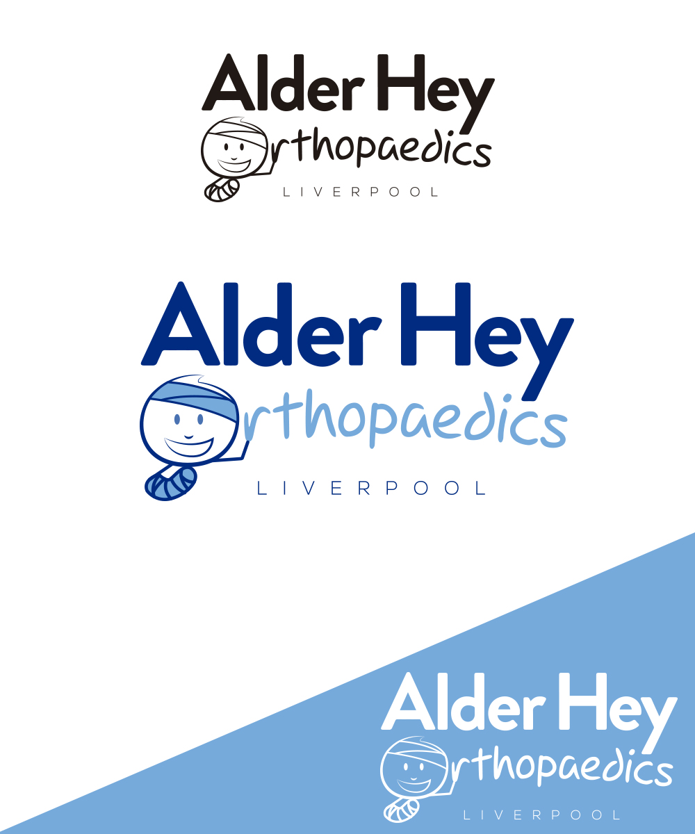
Alder Hey Hospital is a large children's hospital in the North West of England.
We need a logo for the orthopaedic (bone) surgery department in this children's hospital.
It would be fun to make the 'O' in orthopaedics into a kids face, and then possibly to have a 'stick' kid lying below it with a cast on his leg. (rough idea attached - it doesn't need to be stuck to it).
We want it to be a little fun, clear to read and set a nice image for our department.
The logo will be used in presentations and on literature.
Marché(s) Cible(s)
Other doctors
Secteur / Type d'entité
Health Care
Texte du logo
"Alder Hey Orthopaedics"
Styles de logo qui vous intéressent
Logo de figurine
Logo avec illustration ou personnage
Styles de police à utiliser
Autres polices appréciées:
- fun
Aspect
Chaque curseur illustre les caractéristiques de la marque client et le style que doit transmettre votre design de logo.
Élégant
Audacieux
Léger
Sérieux
Traditionnel
Moderne
Sympathique
Professionnelle
Féminin
Masculin
Coloré
Conservateur
Économique
Haut de gamme
Exigences
Doit avoir
- "Alder Hey" quite clear to read
- "Orthopaedics" can be a little more fun.
Bien d'avoir
- A stick man, with his head as the 'O' in orthopaedics. The stick man with some injuries (but happy). Make it kid-friendly. Perhaps the man could have a stick body with a plaster cast on his arm/leg. He could be giving a 'thumbs up'.
- You could flip the words over so it reads "Orthopaedics Alder Hey" to enable some room for legs and a body - he could be standing or sitting. He could have some crutches.