Female's Lifestyle Blog Logo
Vous souhaitez remporter un projet comme celui-ci ?
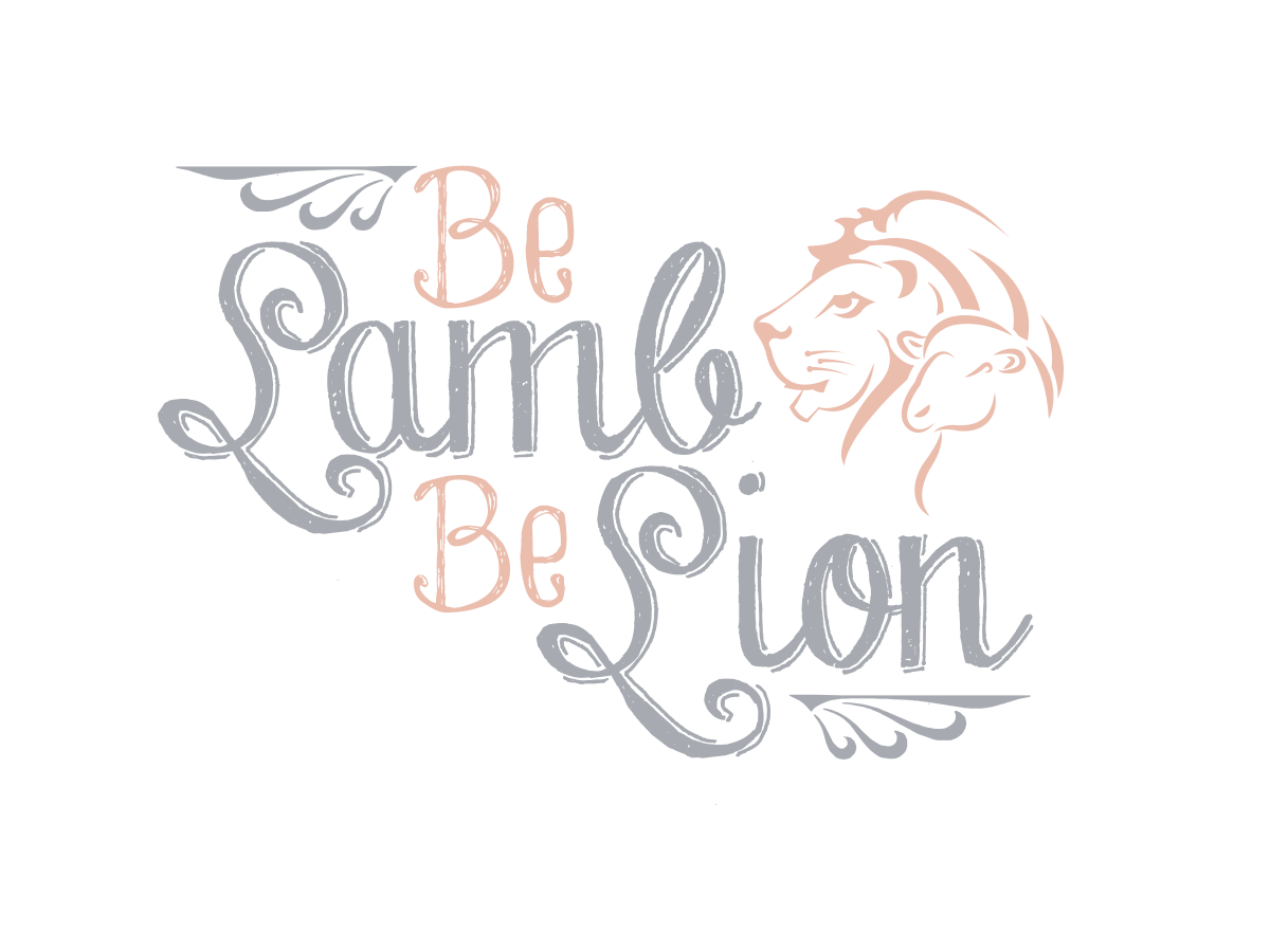
Ce client a reçu 37 designs graphiques de la part de 12 designers. Il a choisi ce design graphique de Grace A comme design gagnant.
Inscrivez-vous Trouvez des Projets de Design- Garanti
-
 US$130
-
 37 designs
-
 12 designers
Brief de Design Graphique
This is a logo for a female's blog. The idea of the "Be Lamb Be Lion " is that each person has a lamb and a lion inside ... We can be both. The blog will blog about beauty, health, fashion, travel, design, through the eyes of a "lamb" or "lion" so it will have a organic, sweet, healthy innocent feel on some posts and a darker, edgier sexier feel on other posts. The logo should be feminine while still being strong . I want the 2 faces of the animals to be the logo.. They should be intertwined in an artistic way. I don't want too much detail in the faces, they should be clean and simple but have strong expressions. The lamb should carry just as much weight as the lion. I like soft colors... Maybe a light gray for the lamb and a gold or nude color for the lion. I could be persuaded to change the colors if the designer feels other ones would be better. The name of the logo should be in cursive or at least feel feminine . Ideas for the head placements are facing toward ahead , facing toward one another or facing away from each other, I will include examples of all 3 . Not too corporate either, soft lines .. I am also including color inspirations... The golds and the lion with the color palette next to him is the softness I speak of... Have fun with it and good luck!! Not too girly but cool and soft with still looking strong and bold. Expressions on the animals should be strong but not mean looking . I also had an idea to use thread to outline the 2 ( in different colors) with both of them facing forward ... Not sure if that idea could work or if it would even look right., but it's a thought.
Mises à jour
Project Deadline Extended
Reason: I am have decided to go a different direction and not use a logo but just go with the words... Could you submit "BeLamb BeLion" as creatively as possible? Modern and sleek but feminine . Thanks!!
Added Saturday, June 13, 2015
Marché(s) Cible(s)
Women from 20-45
Secteur / Type d'entité
Entertainment
Styles de police à utiliser
Couleurs
Couleurs choisies par le client et à utiliser dans le design de logo:
Aspect
Chaque curseur illustre les caractéristiques de la marque client et le style que doit transmettre votre design de logo.
Élégant
Audacieux
Léger
Sérieux
Traditionnel
Moderne
Sympathique
Professionnelle
Féminin
Masculin
Coloré
Conservateur
Économique
Haut de gamme
Exigences
Doit avoir
- Must have "BeLamb BeLion" written as is...
Bien d'avoir
- Maybe a combo of non -cursive and cursive fonts .... What ever looks the best
Ne doit pas comporter
- Must not feel corporate but still should look professional and upscale . No realistic drawings of animals , but don't want drawings too cartoony... They must look modern and cool, but with a spirit to them .