Humor Resources Website - Corporate Comedy Show
Vous souhaitez remporter un projet comme celui-ci ?
Ce client a reçu 48 web designs de la part de 7 designers. Il a choisi ce web design de Sbss comme design gagnant.
Inscrivez-vous Trouvez des Projets de Design- Garanti
-
 US$560
-
 48 designs
-
 7 designers
Brief de Web Design
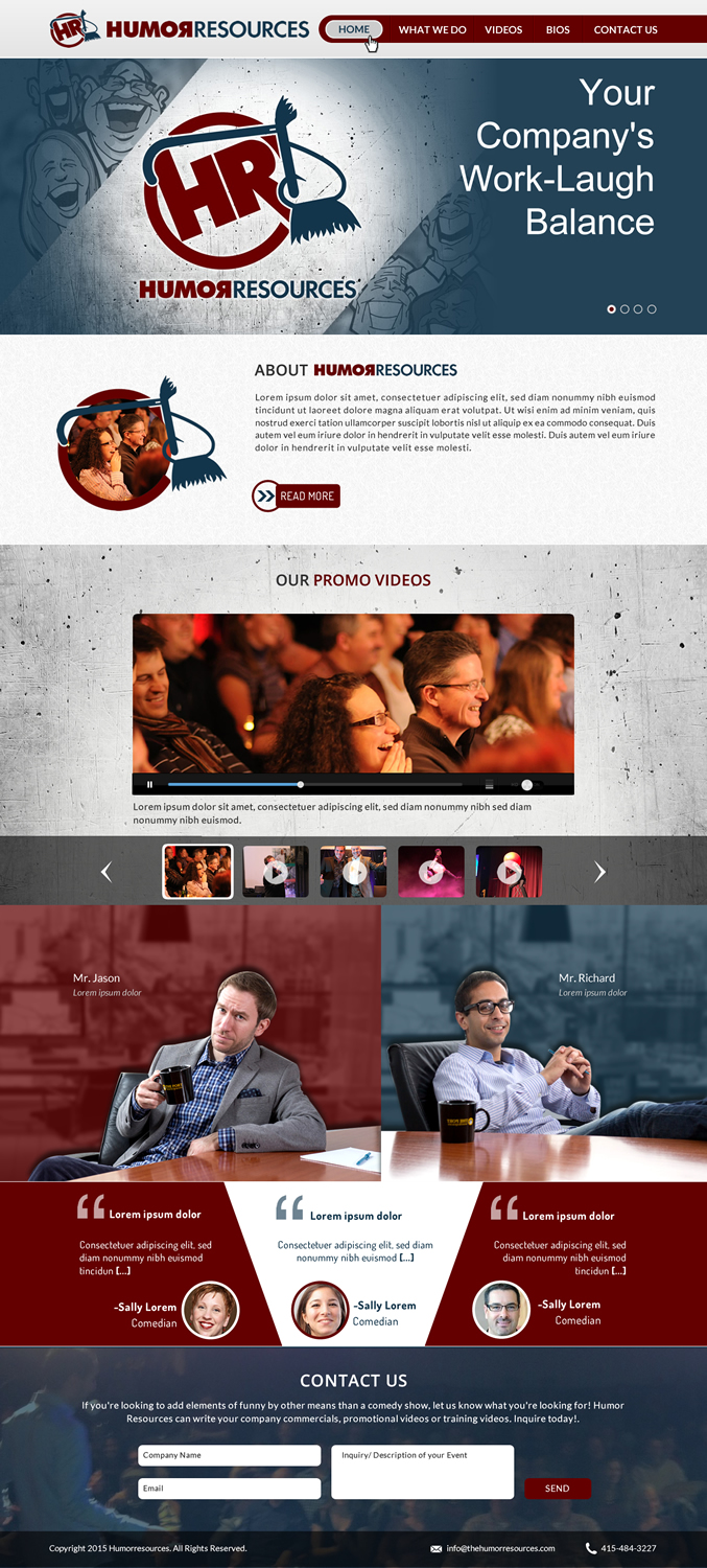
I've created a company called "Humor Resources". We put on corporate comedy shows for companies all over the country. I'd like to design a nice, sleek, professional website, similar to Uber's: https://www.uber.com. We like the one page layout.
Tagline: Your Company's Work-Laugh Balance
I need the following sections:
1. first section would be scrolling images of the company logo and tagline, with 2 or 3 other scrolling images. Testimonials.
2. The next section below would be an about the company section. a small paragraph describing what we do.
4. The next section below would be for a promo video
5. The next section below would be for bios...my partner and I would have transparent head shots, side by side split-screen. When you hover over our headshots, a button for "bio" appears. When you click the "bio" button, an expanded bio appears.
6. Contact section. Newsletter subscription. A section where people enter their email and short message of what they're linking for that will link directly to our email addresses.
7. Additional content. Scrolling video gallery of our sketch videos. (a section that links to a page with videos and content)
Marché(s) Cible(s)
Corporate Executives, Event Planners, Event Coordinators, Marketing and HR managers, Venue owners
Secteur / Type d'entité
It Company
Code
Codé - Design et Code demandé
Nombre de Pages Demandé
1 page
Styles de police à utiliser
Autres polices appréciées:
- FunctionPro
Aspect
Chaque curseur illustre les caractéristiques de la marque client et le style que doit transmettre votre design de logo.
Élégant
Audacieux
Léger
Sérieux
Traditionnel
Moderne
Sympathique
Professionnelle
Féminin
Masculin
Coloré
Conservateur
Économique
Haut de gamme
Exigences
Doit avoir
- -Please use the branded colors from the logo. Burgundy and Blue;
- -A contact section where people put in their email address, company they are from and a small memo to describe the event they're hosting, which will then get sent directly to our email accounts;
- -email accounts that are "jason@thehumorresources.com" and "richard@thehumorresources.com" that link to our gmail accounts
- -getting our domain linked and hosted and all setup (www.thehumorresources.com- bought from NameCheap)
Bien d'avoir
- Build in Wix because we are familiar with it and know how to update
Ne doit pas comporter
- basic, generic look. too much white space (but soon is good!)