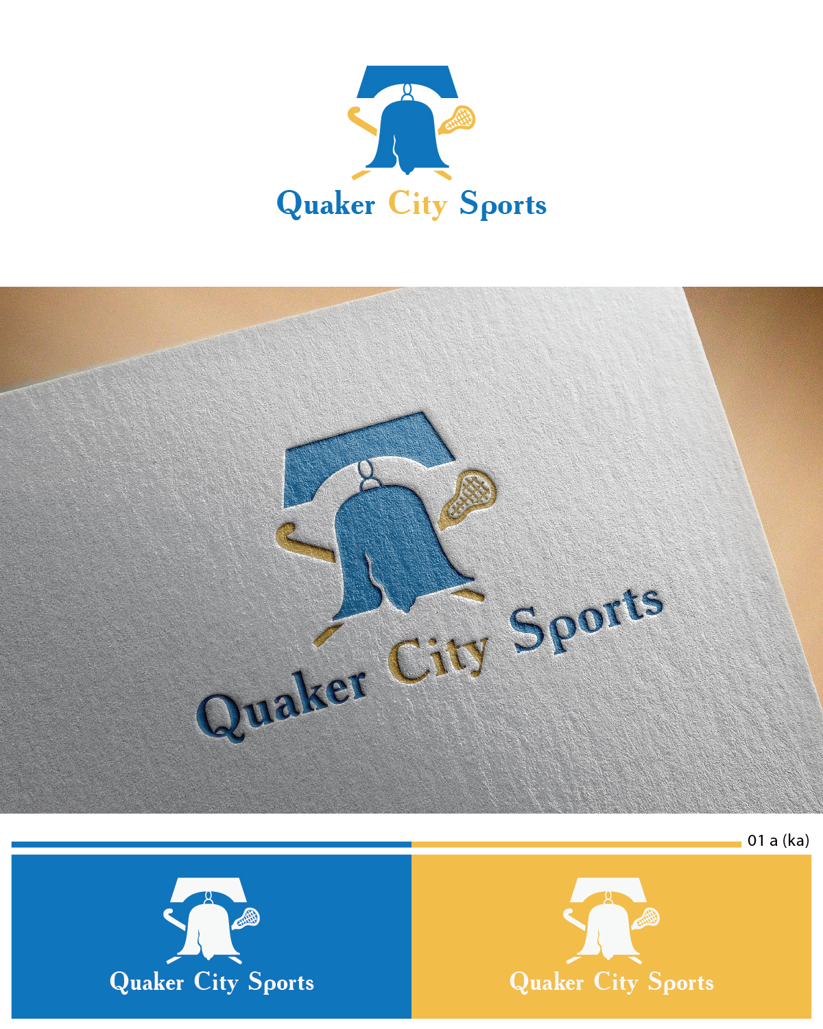
Logo design for Quaker City Sports (field hockey and lacrosse programs for youth)
Gagnant
Vous souhaitez remporter un projet comme celui-ci ?
Ce client a reçu 30 designs de logo de la part de 10 designers. Il a choisi ce design de logo de Esolbiz comme design gagnant.
Inscrivez-vous Trouvez des Projets de Design-
 US$160
-
 30 designs
-
 10 designers
Brief de Design de Logo
We need to combine the look of two separate organizations’ logos into one logo. We will get rid of the name Filia and go with "Quaker City Sports" but we like the look and feel of Filia. We do like the liberty bell on Quaker City (we are in Phildelphia, PA). Lastly, Quaker City Sports will be both field hockey and lacrosse so we want both sports to be captured in the logo. See current logos in attachment.
Marché(s) Cible(s)
Parents and kids ages 6-16
Texte du logo
Quaker City Sports
Aspect
Chaque curseur illustre les caractéristiques de la marque client et le style que doit transmettre votre design de logo.
Élégant
Audacieux
Léger
Sérieux
Traditionnel
Moderne
Sympathique
Professionnelle
Féminin
Masculin
Coloré
Conservateur
Économique
Haut de gamme
Fichiers
Télécharger tous les fichiers - 0,1 MBPNG
filia_logo_v1b Monday, 11 May 2015 18:50:06
jeudi 14 mai 2015
JPG
Paiements
1e place
US$160