

 Rafraîchir
Luxury Upmarket Hair Salon Needs a Logo Design
Vous souhaitez remporter un projet comme celui-ci ?
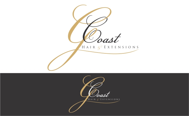
Ce client a reçu 74 designs de logo de la part de 18 designers. Il a choisi ce design de logo de Mandarina comme design gagnant.
Inscrivez-vous Trouvez des Projets de Design
-
 A$200
A$200
-
 74 designs
-
 18 designers
Brief de Design de Logo
We need a logo design for a new hair studio based at the Gold Coast, Australia. We specialise in hair design and colour and also (mainly) prestige hair extensions. We are aiming to portray a classy and prestige look through our logo. This is the first step in designing our modern image, this logo will be used on our website, vehicle advertising, business cards, shirts, etc.
We would like to see designs that use black and white and possibly charcoal/greys (Not too much into colours, simple colours are more classy to us however if you believe adding a colour could appeal and enhance the logo please do perhaps just a neutral tone though - no pink or other colours that are too bright and out there) Cool and sleek is what we want. We would like the option of using either a black or white background so will need to see the design in both colours. The final design should communicate class and sophistication.
G Coast sounds cool so needs to have the G Coast as a feature of the logo.
We are drawn to possibly having the G Coast in some sort of modern cursive font (not too fine though, needs to have character be uber cool and stand out but still be elegant) In saying this we find that many cursive fonts are too busy and curly and are hard to read/recognise at a glance which is a major concern for us.
Depending on the look (open to your creative input on this journey) you come up with we thought that G Coast and Hair & Extensions will be on separate lines maybe in different fonts. Again, we welcome creative input.

Mises à jour
As per the brief we would like to use different fonts for the second line 'Hair & Extensions' we may like a more simple spaced out font for this, whether these are all in capital letter or lower case we will need to see what it looks like. Hair & Extensions could even have a thin line above and below the wording to place more emphasis on the 'G Coast" Fonts we don't like - Traditional old english.. they look a little tacky however if you think you can change it up a little to make it look cool, modern and prestige please feel free. I've found some fonts I like for the 'G Coast', but again we're looking to you guys to add creativity. One Font name I found on the net that we like is Champignon. We could even have a fancy 'G' (and even the 'C' from Coast in the same font and then a different font for the rest) The font Old Script looks 'okay' (not as good as Champignon though so not overly interested in this) but could use a little more sprucing up to make it more unique. We are looking to use the Letter 'GC' on our products in the future so the fonts need to work for this as well :)
Added Wednesday, March 20, 2013
Marché(s) Cible(s)
Age group 20-50. Mostly women for colour and extensions however some men for other services so must not be too feminine but still elegant, cool modern and classy.
Secteur / Type d'entité
Hair
Texte du logo
G Coast Hair & Extensions
Styles de logo qui vous intéressent
Logo mot symbole
Logo (texte seulement)


Aspect
Chaque curseur illustre les caractéristiques de la marque client et le style que doit transmettre votre design de logo.
Élégant
Audacieux
Léger
Sérieux
Traditionnel
Moderne
Sympathique
Professionnelle
Féminin
Masculin
Coloré
Conservateur
Économique
Haut de gamme
Exigences
Doit avoir
- We do like the idea of creative and bold cursive fonts as long as their legible for the 'G Coast' and then the 'Hair & Extensions' in a more simple and plain font. Creativity is up to you, open to suggestions and font types. Must be unique and not a common font that is recognisable by people to be a font we could have done ourselves.
Ne doit pas comporter
- Should not use overly curly cursive fonts that customers can't easily read. Needs to be prestige, unique, memorable and set us apart.