Industrial real estate agency
Vous souhaitez remporter un projet comme celui-ci ?
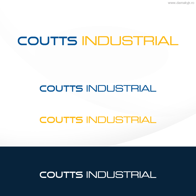
Ce client a reçu 132 designs de logo de la part de 35 designers. Il a choisi ce design de logo de damakyjr comme design gagnant.
Inscrivez-vous Trouvez des Projets de Design- Garanti
-
 A$310
A$310
-
 132 designs
-
 35 designers
Brief de Design de Logo
We require the modernisation of our logo (attached). The logo will be used on real estate signage (where it must be bold), as well as on stationery, business cards, building signage etc.
We are looking to project an image of: modernity, professionalism, corporate.
We are specialist commercial/industrial property agents. We have been around 50+ years and are a well recognised name in our area. Accordingly, we would not want to stray too far from our existing branding.
Updates
In terms of colour, we are liking the ones where the blue (in particular) is lightened or darkened.
Some designs are too fussy - remember, sign board is most common application, and so needs to be clear.
Dont be too focused on an image to go with the logo - I'd concentrate more on the structure of the words.
Thanks very much for the designs so far
Added Friday, June 03, 2011
The weakness of most of the designs so far is that they are too close to the original or too finicky. Id prefer something far more simple and modern. Perhaps with some throwback tot he colours.
I think the blue and yellow (in particular) looks too garish, which is why I suggested lightening up the colours somewhat. Dont be too trapped by the red (either).
Type face needs to be bold, simple, modern.
see: gunningcommercial.com - this is more the style I'm thinking....
our previous winning one is at:
www.westsideindustrial.com.au
another of our brands is:
www.norwestcommercial.com.au
there's probably a bit of a theme...
Added Thursday, June 09, 2011
Project Deadline Extended
Reason: Some of the designs are getting closer... hopefully, my latest comments are of assistance. Any specific questions, please ask
Added Friday, June 10, 2011
Project Deadline Extended
Added Friday, June 17, 2011
Project Deadline Extended
Reason: sorry - havent had time to finalise decision with team
Added Friday, July 01, 2011
Project Deadline Extended
Added Friday, July 08, 2011
Marché(s) Cible(s)
Business owners/professionals. Many people will see our logo as they drive past properties.
We also have a large number of older clients who may find dramatic change (and too modern a design) too confronting.
Secteur / Type d'entité
Real Estate
Texte du logo
Coutts Industrial
Styles de logo qui vous intéressent
Logo d'Enseigne
Logo contenu dans une forme
Logo de figurine
Logo avec illustration ou personnage
Logo mot symbole
Logo (texte seulement)
Logo de Lettermark
Acronyme ou logo texte (texte seulement)
Aspect
Chaque curseur illustre les caractéristiques de la marque client et le style que doit transmettre votre design de logo.
Élégant
Audacieux
Léger
Sérieux
Traditionnel
Moderne
Sympathique
Professionnelle
Féminin
Masculin
Coloré
Conservateur
Économique
Haut de gamme
Exigences
Doit avoir
- The new logo must be able to be used well horizontally, eg on the bottom of a real estate signboard where there is lots of space horizontally but not vertically.
Logo needs to be fairly simplistic, easy to read and impactful. Bear in mind that the most common application for the logo is on real estate signboards which are 6 x 4' and are located outside buildings, so cannot be too fussy. It will also be used on the internet
Bien d'avoir
- We are most likely to select a logo that works in with the current colour scheme (broadly sky blue and yellow)... see website: www.coutts.com.au
Ne doit pas comporter
- Images associated with residential property - we are industrial agents and only deal with warehouses, offices, sheds, land, shops. No houses please.