

 Rafraîchir
Innovative and Individualized approach to Pharmacy Care, less focus on dispensing of Meds
Vous souhaitez remporter un projet comme celui-ci ?
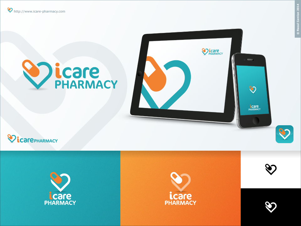
Ce client a reçu 57 designs de logo de la part de 15 designers. Il a choisi ce design de logo de Raoul Camion comme design gagnant.
Inscrivez-vous Trouvez des Projets de Design
-
 C$320
C$320
-
 57 designs
-
 15 designers
Brief de Design de Logo
We need a logo design for our new pharmacy in Alberta, Canada. Now with a new compensation model that allows for pharmacist to prescribe medications and administer injection, we hope to start a practice that will focus on these developments. Aside from the general business of dispensing and checking medications we hope to do in home medication reviews and consultation for patients and physicians and expand in travel consultations and flu injections. The "i" in iCare will stand for " individualized care" , "innovative therapy" and "independently owned".
The main colors will be teal/blue and orange as the accent color. A graphic in the background is We really like the colors used by the company Moroccanoil Hair Products in their design
http://www.moroccanoil.com/usa/h_us_en/products/
and would like to incorporate similar colors. We are not opposed to other color combinations that the designer would like to suggest. The design needs to be simple and modern to reflect the new approach we are incorporating into our business. We would like the "i" to be in lower case and to stand out in the design. It would be fine to have some sort of graphic in the background
Marché(s) Cible(s)
Middle age to Elderly Patients
Secteur / Type d'entité
Pharmacy
Texte du logo
iCare Pharmacy
Styles de logo qui vous intéressent
Logo abstrait
Conceptuel / symbolique (texte facultatif)



Styles de police à utiliser

Aspect
Chaque curseur illustre les caractéristiques de la marque client et le style que doit transmettre votre design de logo.
Élégant
Audacieux
Léger
Sérieux
Traditionnel
Moderne
Sympathique
Professionnelle
Féminin
Masculin
Coloré
Conservateur
Économique
Haut de gamme
Exigences
Doit avoir
- "I" should be in lowercase. Try to incorporate more traditional elements into a modern design.. A mortal and pestle..
Bien d'avoir
- Id like a graphic above or beside the name. I like how this one is circular and has ring of orange around the top of it as the accent colour.. Perhaps if we could figure out some other type of graphic instead of a DNA strand in the middle
- http://www.tinkytyler.org/logo-template/81895-graphicriver-bio-research-logo-template-5162401.html
- Ideally if we could incorporate a heart into design that would be a plus. We would like it to be something abstract also such as this one
- http://www.tinkytyler.org/logo-template/111475-graphicriver-foundation-logotype-6490365.html
Ne doit pas comporter
- We do not want a traditional logo such as most pharmacies.. so no times roman fonts.