

 Rafraîchir
Wedding filmmaker needs artistic business card design - summerfieldfilms.ca
Vous souhaitez remporter un projet comme celui-ci ?
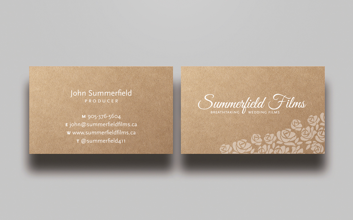
Ce client a reçu 74 designs de carte de visite de la part de 11 designers. Il a choisi ce design de carte de visite de MtBosh comme design gagnant.
Inscrivez-vous Trouvez des Projets de Design
- Garanti
-
 C$125
C$125
-
 74 designs
-
 11 designers
Brief de Design de Carte de Visite
We are high end wedding filmmakers in a major market who produce cinematic wedding films. We require a business card design that communicates our quality, artistry, and professionalism yet looks progressive and friendly. Colors and design should skew appeal more to the bride-to-be who is usually the decision maker but not be overtly feminine per se. This means generally light pastel shades of ivory, purple, pink, yellow, as examples.
We already have a name logo established: the words "Summerfield Films" in the font Great Vibes. Designs must use Kraft natural cardstock as the print stock and am leaning heavily toward our name logo in white, but I am open to black as well. Please design any color elements with spot white underneath where possible.
Do not try to compliment or take inspiration from our website design. Treat the card design as a separate stand alone.
Thank you so much for your hard work!
Marché(s) Cible(s)
Affluent couples spending $50,000+ on their wedding
Secteur / Type d'entité
Progressive
Coordonnées pour la Carte de Visite
John Summerfield
Producer
905-376-5604
www.summerfieldfilms.ca
john@summerfieldfilms.ca
twitter @summerfield411
Styles de police à utiliser


Aspect
Chaque curseur illustre les caractéristiques de la marque client et le style que doit transmettre votre design de logo.
Élégant
Audacieux
Léger
Sérieux
Traditionnel
Moderne
Sympathique
Professionnelle
Féminin
Masculin
Coloré
Conservateur
Économique
Haut de gamme
Exigences
Doit avoir
- - Summerfield Films name logo (reference GIF uploaded for reference only) and catch phrase: Breathtaking wedding films (I'm open to capitalizing all three words, or just first, or all in small caps). I favor logo, and catch phrase on front of card and my contact details on the other side but if you feel strongly about a different design, go for it!
- - Design must be submitted shown on Kraft natural cardstock NOT WHITE cardstock, If you're not familiar with Kraft, this is what it looks like: http://www.papernstitchblog.com/wp-content/uploads/2013/07/il_570xN.451912512_ja6n.jpg
Bien d'avoir
- - An original graphic element (eg. movie reel, bouquet, confetti, etc.) that compliments the name logo but is subtle and discreet, doesn't overpower or entangle it.
- -Great use of balance, composition, negative space, etc. I like clean tasteful design
Ne doit pas comporter
- -Lousy boring clip art.
- -Graphic elements, fonts, or color palette from our website
- -White cardstock background
- -designs you have previously submitted for other contests
- -Bold dark colors (eg. red, orange navy blue, etc.)
- -High tech futuristic designs like you'd create for a software company
