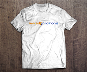
Stylish logo re-design for modern physiotherapy company
Une entreprise en/au(x) recherchait un graphic design et a reçu 39 graphic designs Massage de 14 designers
Designs
Designers
Budget


1 - 20 de 39 Propositions de %
C'est ce qu'une entreprise en/au(x) United Kingdom recherchait pour leur graphic design
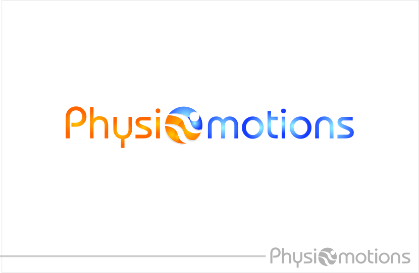
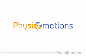
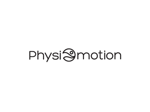
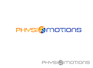
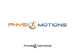
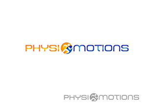
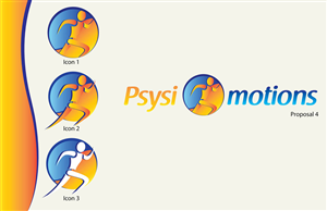
My company is called Physiomotions and it delivers physiotherapy and sports massage therapy. The website is www.physiomotions.co.uk.
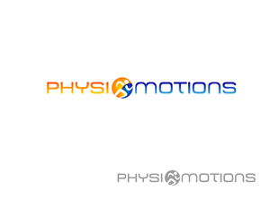
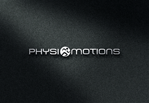
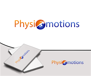
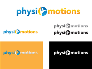
I've uploaded two logo designs. The first ('logo template') is the one the company has been using since it was set up. The logo doesn't look enough like an 'O' for Physiomotions. There is too much going on with the design - too many shapes and colours. It is also not in proper vector format so it can't be expanded for banners.
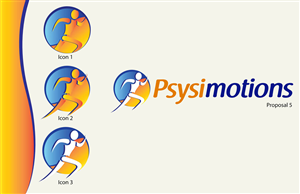
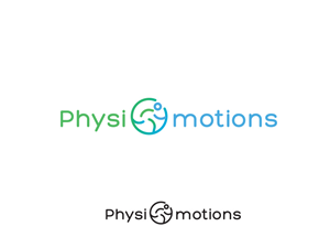
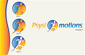
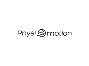
I want the logo to become more modern and minimalistic while incorporating a sense of what the company is. The current logo does that through the running man.
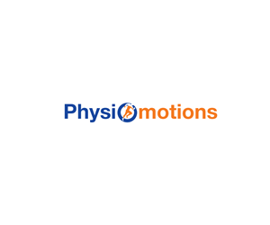
The second logo I have attached ('logo design physiomotions') is an attempt which I quite liked. I like the way the 'O' flows from the colour of the physio to the colour of the motion. I also like the 3D effect of the 'O' and the simplicity of it. However it did not capture the running man very well, the arms and legs look to much like waves. Also …
Voir plus