Logo for web application for the advertising industry
Vous souhaitez remporter un projet comme celui-ci ?
Ce client a reçu 53 designs de logo de la part de 14 designers. Il a choisi ce design de logo de Anthony comme design gagnant.
Inscrivez-vous Trouvez des Projets de Design- Garanti
-
 US$200
-
 53 designs
-
 14 designers
Brief de Design de Logo
We are a small software outfit located in Copenhagen, Denmark and Bangladesh Dhaka. We are developing a cloud based application targeted at marketing professionals in both advertising agencies and marketing departments.
The market we are entering is called marketing resource management. Here some of the key players are: Orbis Global, Aprimo, BrandMaker, Unica. Basically marketing resource management is about orchestrating processes around producing marketing materials and bringing technology into those processes.
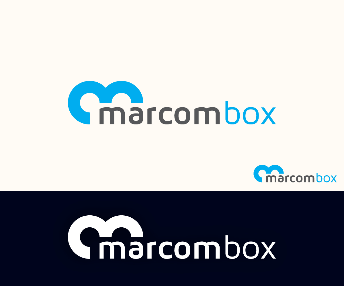
Our product is called Marcombox (marcom = marketing communications) and our goal is to be for the marketing resource management market what SalesForce has been for the CRM market. Basically we are coming out with a simple, easy to use product that is much simpler to buy and own than any of the existing solutions.
Core ideas in our product are: share, reuse, organize, orchestrate, know.
Primary medium is our website so the logo should work well in a topbar. Would be great if the logo contains a visual element that can work as an app icon.
Marché(s) Cible(s)
BtB : advertising agencies and marketing departments
Secteur / Type d'entité
Advertising
Texte du logo
marcombox (could be spelled MarcomBox or Marcombox too)
Styles de logo qui vous intéressent
Logo de figurine
Logo avec illustration ou personnage
Logo mot symbole
Logo (texte seulement)
Aspect
Chaque curseur illustre les caractéristiques de la marque client et le style que doit transmettre votre design de logo.
Élégant
Audacieux
Léger
Sérieux
Traditionnel
Moderne
Sympathique
Professionnelle
Féminin
Masculin
Coloré
Conservateur
Économique
Haut de gamme
Exigences
Doit avoir
- The logo must work well for a website and respect that the top bar of a website is expensive real estate. It should fit in a top bar of some 55-60 px. Overall the design we are using in the app is flat, without gradients and 3d effects.
Ne doit pas comporter
- try to avoid using a box as part of the logo - we don't want to get confused with box.com