Systems and Technology Consultants - Website
Vous souhaitez remporter un projet comme celui-ci ?
Ce client a reçu 111 web designs de la part de 19 designers. Il a choisi ce web design de WYSIWYG comme design gagnant.
Inscrivez-vous Trouvez des Projets de Design- Garanti
-
 US$560
-
 111 designs
-
 19 designers
Brief de Web Design
Design & Build a website for a new company which operates in the Systems and Technology space for Transportation, Government and Commercial sectors.
Overall design should be minimalist in nature.
Should also have a feed that provides news and event updates on the main page.
Logo has already been awarded and should be incorporated into the site.
We like the overall layout, functionality and simplicity of the below sites. Submitted designs could be similar to or a combination of the aspects on these sites, or perhaps a whole different concept - we are open to new ideas.
Dialexa.com
Saiv.it
Update 1 Dated 27 May 2014
All I am moving away from the Saiv.it website and would like it to be more aligned with Dialexa.com not only in layout but in functionality. I will be extending the deadline of this design brief for two weeks to incorporate additional requirements and will add addtional funding to the project.
Apologies for not having more information available to provide but with so many submissions its getting confusing.
Thanks Allan
Mises à jour
Please note that the brief has been updated and the deadline has been extended.
Added Tuesday, May 27, 2014
Hello All,
Thank you for your submissions. We have narrowed it down to the final 6 designers and I just wanted to take a moment and provide a bit of feedback regarding the concepts that we like and the modifications we are looking for.
First, let me mention some of the design functions we like.
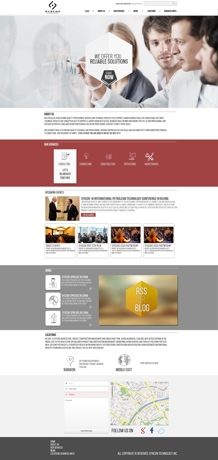
- At the top of the homepage we really like the "region" or "language" tab so that the website can be viewed in both English and Arabic.
- We like the homepage to have clear color variation so that the different sections of the homepage are distinct. Additionally, we like the bottom portion of the homepage to be in red. We feel that draws attention to our contact information. Again, we would like the colors to integrate black, gray-scale, red, etc.
- Having a search tab at the top of the home page, or integrated into the main image, so that the site is easy to navigate.
- We especially like the main image to have the scrolling tabs at the bottom so it is easy to browse the services offered (Consultancy, Solutions Architecture, Masters Systems Integration, Independent Design Review).
- In regards to the services offered tab we really like the idea that a few people presented that have the outside of our logo with an icon in the middle of consultancy, solutions, etc., etc.
Secondly, as mentioned in our brief we really enjoy the design of dialexa site. Specially, we enjoy the strong iconic images they use, the way the tabs at the top scroll easily, and contact us page that generates an email.
Lastly, I've included some photos of the concept we have been working on. What we are trying to demonstrate is how our company offers a range of services that are essentially linked together. We provide individual services that when combined present the full service package. We would like this concept to be integrated into the over concept of our website.
Please feel free to ask for clarification of any of the above points or contact us if you have any additional questions. We appreciate all of your hard work and are very excited to see the updated designs.
Best,
Lauren Schluete
Syscontech
Senior Program Manager
lauren.schlueter@syscontek.com
Added Thursday, July 03, 2014
Secteur / Type d'entité
Government
Styles de police à utiliser
Aspect
Chaque curseur illustre les caractéristiques de la marque client et le style que doit transmettre votre design de logo.
Élégant
Audacieux
Léger
Sérieux
Traditionnel
Moderne
Sympathique
Professionnelle
Féminin
Masculin
Coloré
Conservateur
Économique
Haut de gamme
Exigences
Doit avoir
- Must work on/adapt to various/mobile devices (responsive)
Must be simple and straightforward
Colors should be in line/matching with logo
2 language versions: English and Arabic (no Thai)
Services should be the first group/row of items after/below the main image
Note: the website will be hosted by godaddy
Bien d'avoir
- Submit feedback form
What's New section
The banner at the bottom of the site should not be too large; we would like a narrow one more
It would be nice if the header/top banner (with Home, About, etc. tabs) could stay in place as you scroll down (like Dialexa and Facebook)
We will likely only use one image with a Company slogan on the Home page rather than a carousel of images to rotate through
Ne doit pas comporter
- This is the existing website: http://www.syscontech.org
We do not like the animation, the way the banner icons/titles bounce
Not simple enough, we don't like the functionality or how pages load so slowly
We do not like the logo centered - it should be at the left
The banner and its tabs should not be towards the right, we would like them to be centered, to go all the way across and to be below the logo