Wipiip Social Media Banner
Vous souhaitez remporter un projet comme celui-ci ?
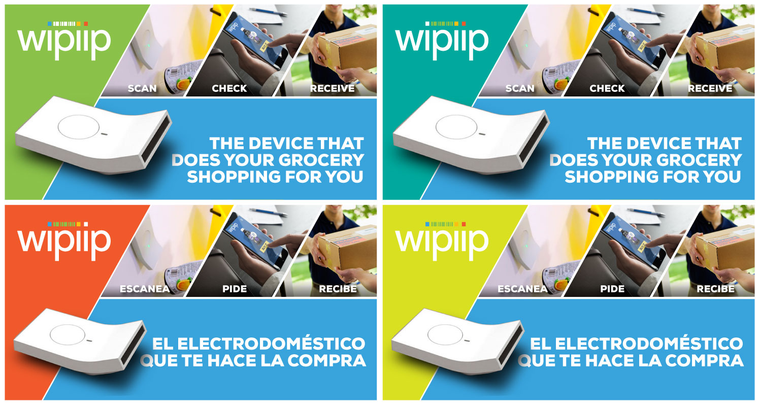
Ce client a reçu 31 designs de bannière de la part de 10 designers. Il a choisi ce design de bannière de eduard131 comme design gagnant.
Inscrivez-vous Trouvez des Projets de Design- Garanti
-
 €110
€110
-
 31 designs
-
 10 designers
Brief de Design de Bannière
The objective of this campaign is to end up with a Banner Add to post in the content of our social media.
We are Wipiip, a business that is going to modify all the grocery shopping mechanism with a simple device. It works the following way. Our device is a bar-code scanner. Once installed in your home, you would scan your groceries trough and it will automatically create your shopping list. Once you decide you have all the items, you just click the “buy” button and you’ll receive your groceries home whenever you have selected. This way is like being in the grocery shop but from home. You’ll find a long video and short video attached to the project.
The objective is to create a Banner Add that simulates the SHORT video with icons. The goal is for the viewer to understand what our device do just by looking at the banner. We have thought about diving the banner into three frames: Scan, Buy and Receive. Although that is what we think is most understandable, let us know if you think otherwise.
For the Scan frame the viewer should be able to see clearly the scanning process of any grocery through our device. I attached a picture of how our device looks like. You could also look for more images googling “Wipiip”.
For the Buy frame there should be a mobile phone. The idea is that the viewer is able to recognize that the Buying process is through an App in your phone. The frame could be only a phone, it could also be a phone with the Wipiip app opened or even a phone with a “Buy” button. Further ideas for this icon will be more than welcome.
The Receive frame should be the easiest one of them all. It should be more than clear the meaning of the frame.
Between the frames, you could add some to enable to understand the whole process. There could be numbers (Example: 1. Scan, 2. Buy, 3. Receive), there could be a plus sign (Example: Scan + Buy = Receive), or there could also be arrows following the process. Again, ideas to this matter will be more than welcome.
Thank you and contact us for questions or more info.
ATTACHED FILES
- Long video: https://www.youtube.com/watch?v=5tkoXXakVxk
- Short Video: https://www.youtube.com/watch?v=mLUV0fCHM0c
- Wipiip Device Picture: https://www.google.es/search?q=wipiip&client=firefox-b-ab&dcr=0&source=lnms&tbm=isch&sa=X&ved=0ahUKEwjlm8DF97DWAhVIJ1AKHbNvCksQ_AUICigB&biw=1366&bih=659#imgrc=kzpU6e5ldlFe5M:
- Wipiip Logo: https://www.google.es/search?q=wipiip&client=firefox-b-ab&dcr=0&source=lnms&tbm=isch&sa=X&ved=0ahUKEwjlm8DF97DWAhVIJ1AKHbNvCksQ_AUICigB&biw=1366&bih=659#imgrc=Oin3R0vZqPkvTM:
- Wipiip App: https://www.google.es/search?client=firefox-b-ab&dcr=0&biw=1366&bih=659&tbm=isch&sa=1&q=wipiip+app&oq=wipiip+app&gs_l=psy-ab.3...47177.47673.0.47781.4.4.0.0.0.0.113.390.3j1.4.0....0...1.1.64.psy-ab..0.0.0....0.PSmC8szSLMg#imgrc=CRzJUajNi7TiNM:
Secteur / Type d'entité
Business
Aspect
Chaque curseur illustre les caractéristiques de la marque client et le style que doit transmettre votre design de logo.
Élégant
Audacieux
Léger
Sérieux
Traditionnel
Moderne
Sympathique
Professionnelle
Féminin
Masculin
Coloré
Conservateur
Économique
Haut de gamme
Exigences
Doit avoir
- Hi again. I just uploaded an example of what we are looking for. Open the file Wipiip_Expositor. We would like the designs to adjust to it. Although that's what we would like, we are open to new propositions.
- IMPORTANT:
- 1. We would like to change where it says scan. I've uploaded a picture called Captura. The idea is to draw the device SCANNING a product so that it is clear the function of the scan.
- 2. Dimensions of the composition. We would like more room for the Scan, Check and Receive compositions. That is going to be done reducing the blue space.
- 3. Bottom of the image. As you will see there is a pretty big grey space at the bottom of the image. The idea is to reduce it a little bit. The corner of the white line should be pretty close to the end of the image, or even touching.